Identity follows language, not the other way around
Most agencies build a logo, choose a palette, deliver a guideline document, and then go looking for the voice that fits. We do it the other way around.
We define the brand-language position first. The names, the tone, the messaging architecture, the creative concept. The visual system inherits that work. The mark becomes the visible signature of a brand that already knows what it stands for.
Designed in the right order, the identity feels inevitable. Designed in the wrong order, it feels like decoration looking for a reason.
What we ship inside an identity system
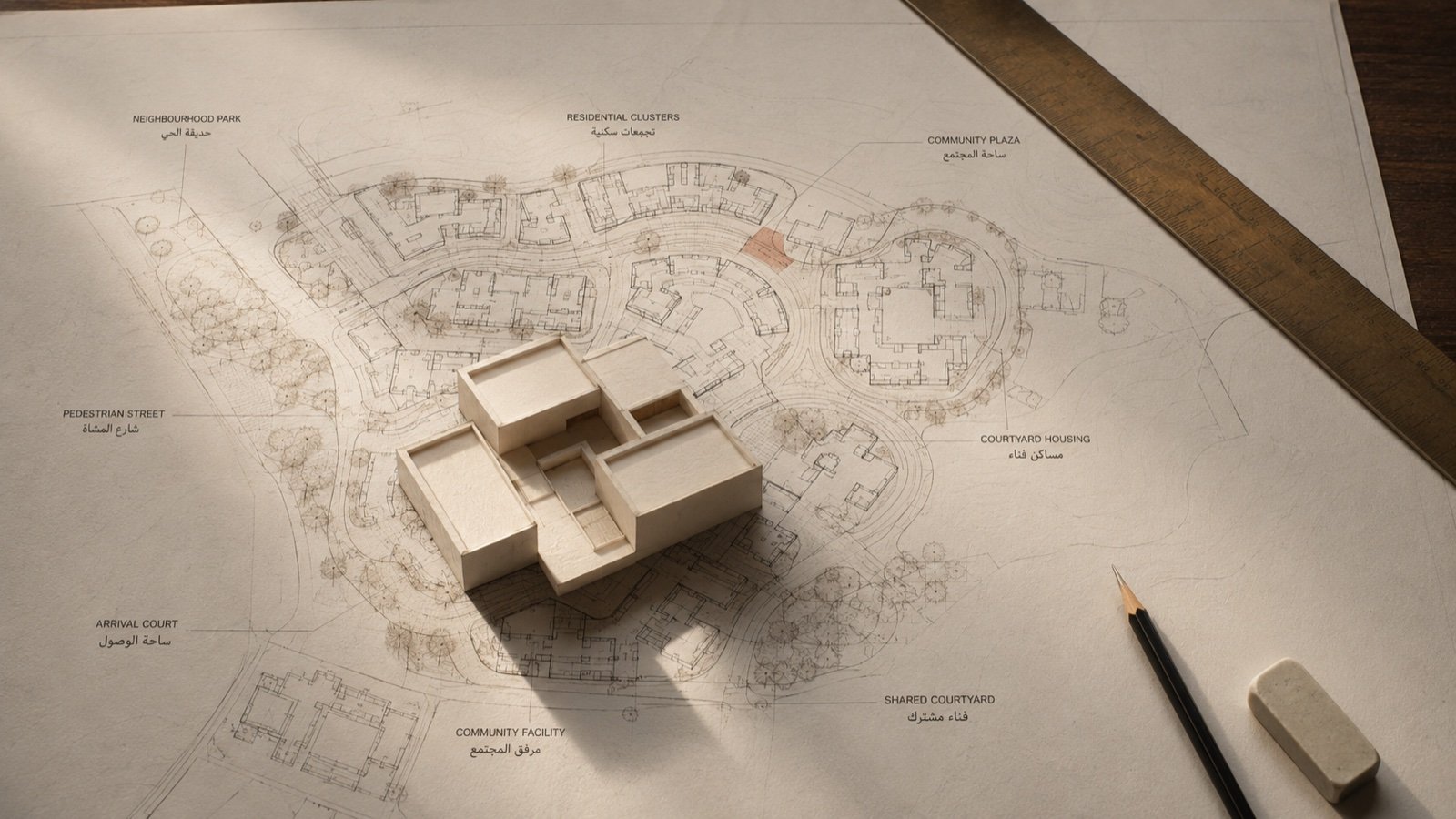
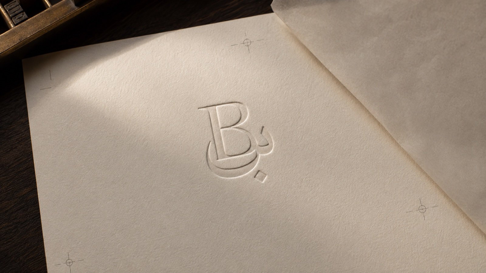
A G7M identity system carries the brand from a primary mark through to the templates the brand will live inside for a decade. The mark and its responsive variants. The typographic system, with bilingual pairs where the brand operates in Arabic. The colour system, with accessibility-grade contrast. The motion principles, because brands now live mostly on screens. The grid and the layout logic. The illustration or photography direction, when the brand earns one.
And the brand guidelines, written for the people who will use them, not for the awards jury.
Identity is judged at five metres, not at the Behance crop
A logo crop on a portfolio site is the easiest place to make work look good. A wayfinding sign in a half-lit lobby is the hardest. We design identities for the hard test first.
Across Andalusia, Centric, AURELIA, and HUB, the identities that have aged best are the ones that did not need favourable lighting to do their job. That is the bar we keep.