VITO RESTAURANT
Fire, bottled into a brand.
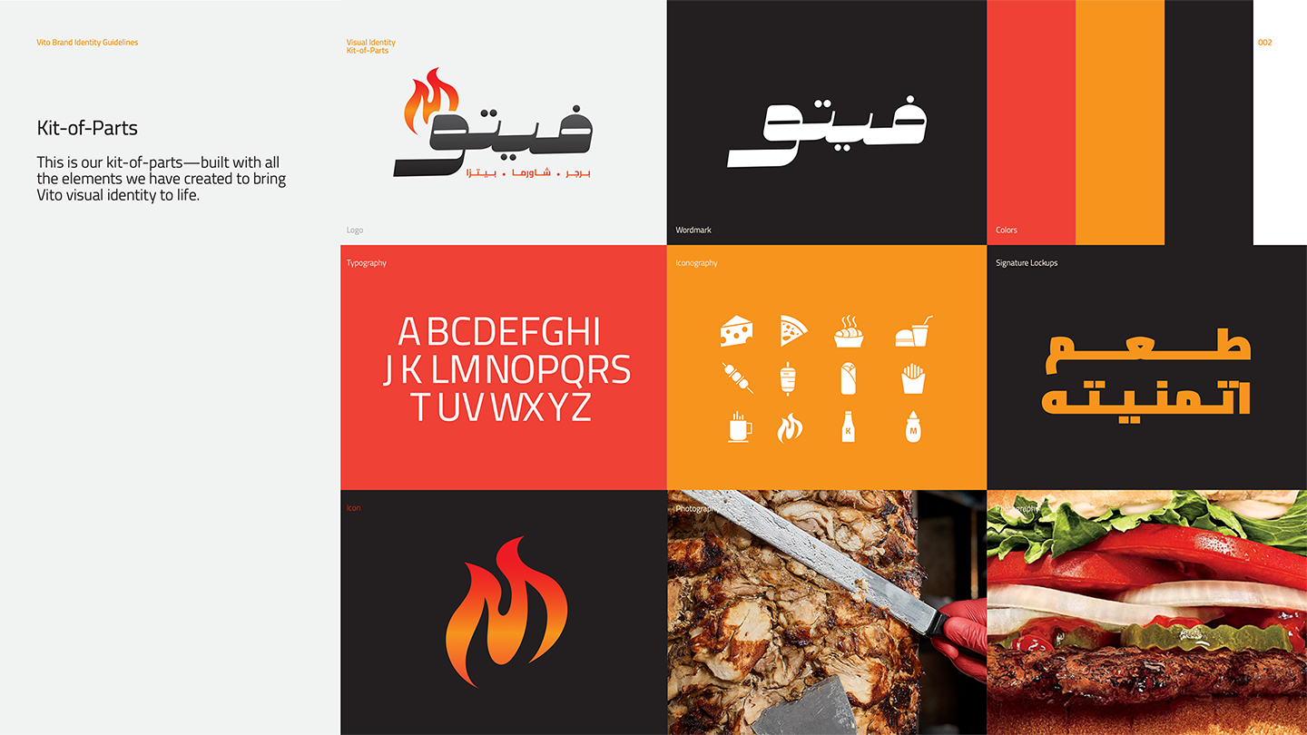

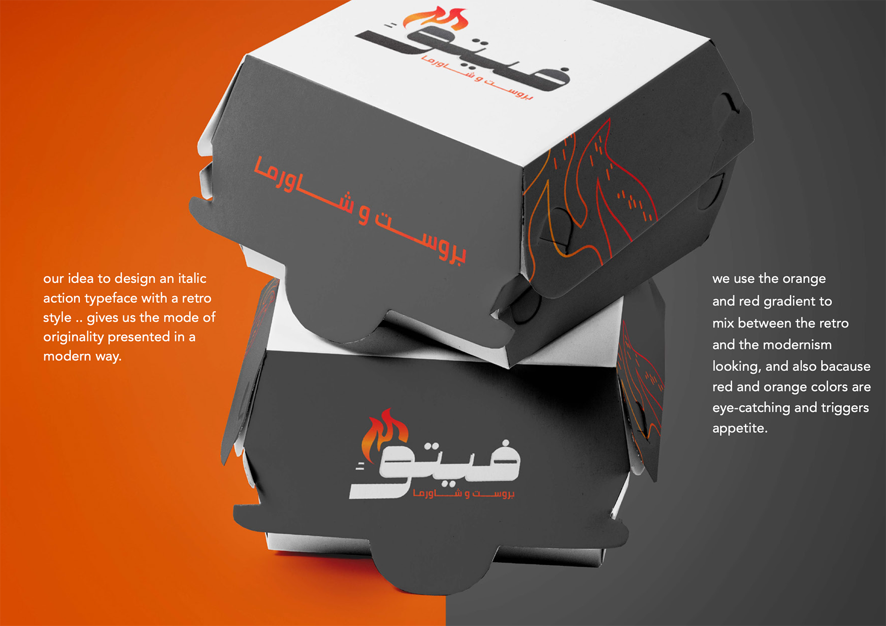
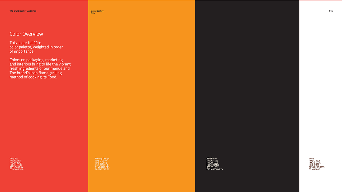
We led brand strategy, identity, and the full brand book for Vito Restaurant in AlUla. The wordmark is a single Arabic word, ﻓﻴﺘﻮ, paired with the English VITO and a stylised flame above it. The system is paced like a fast-food brand should be: fiery red, flaming orange, BBQ brown, and a typography family that goes from menu boards to packaging without breaking stride.
- Brand Strategy
- Brand Identity
- Brand Book
- Packaging Design
- Advertising Campaign
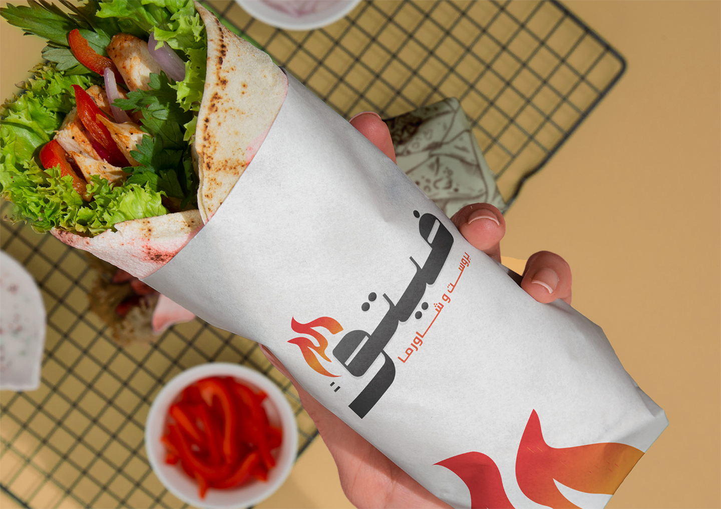
Fire, on the wrap.
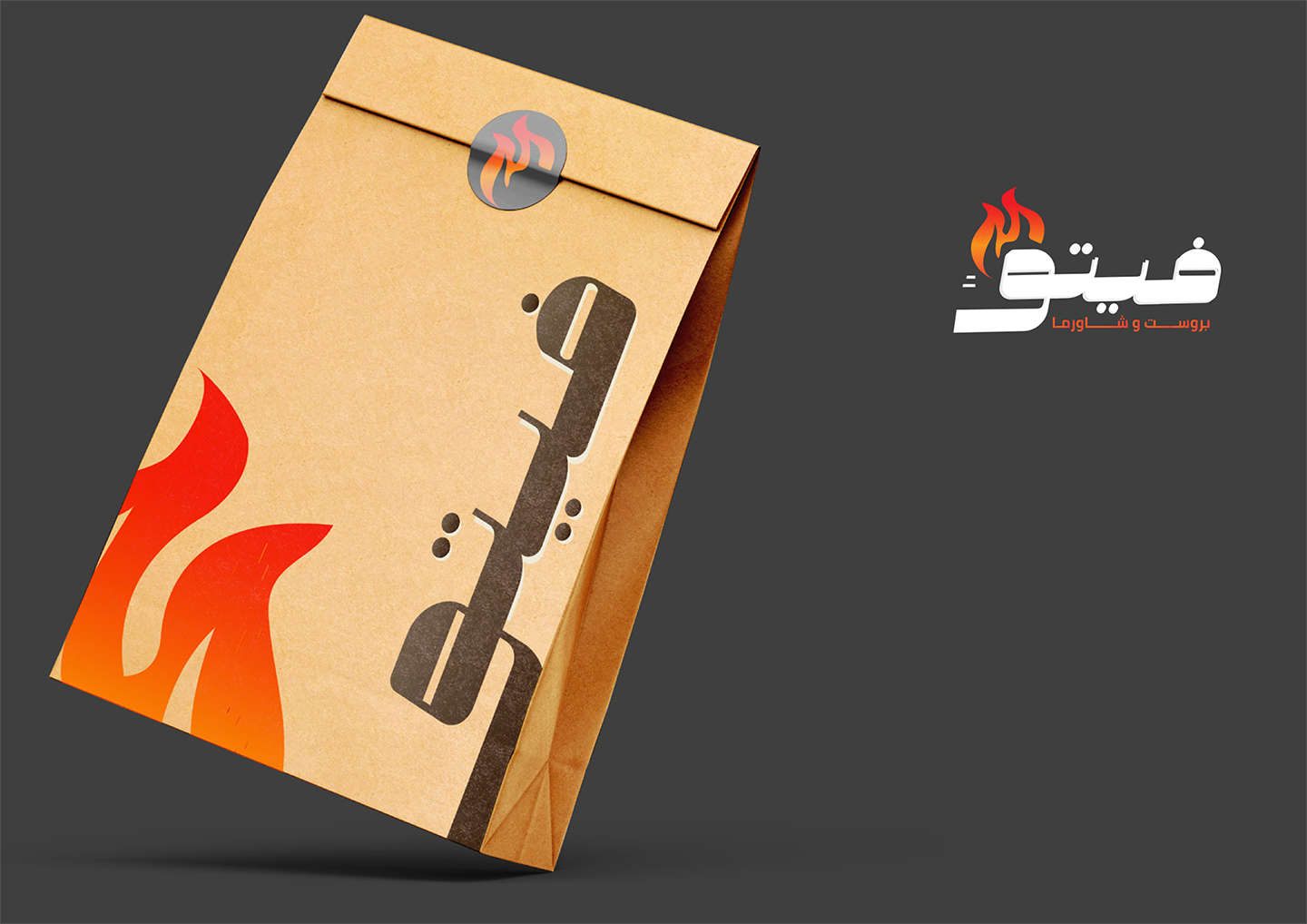
We anchored the Vito brand in the moment it actually shows up: hot food, in your hand, in a paper that says the rest. The bilingual mark sits flat across the wrap, the small flame icon does the work above it, and the customer is already in.

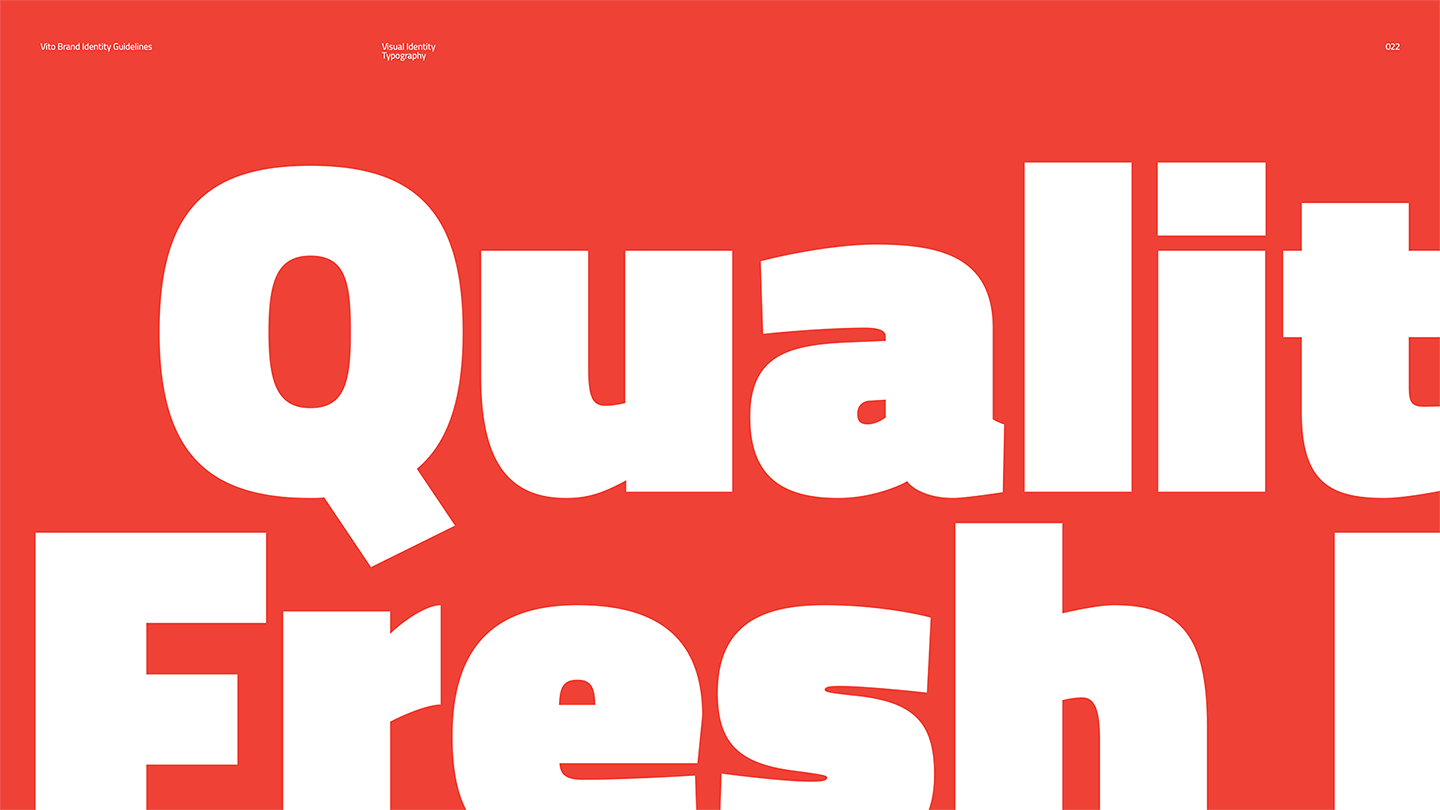
Steeped in strategy, set in red.
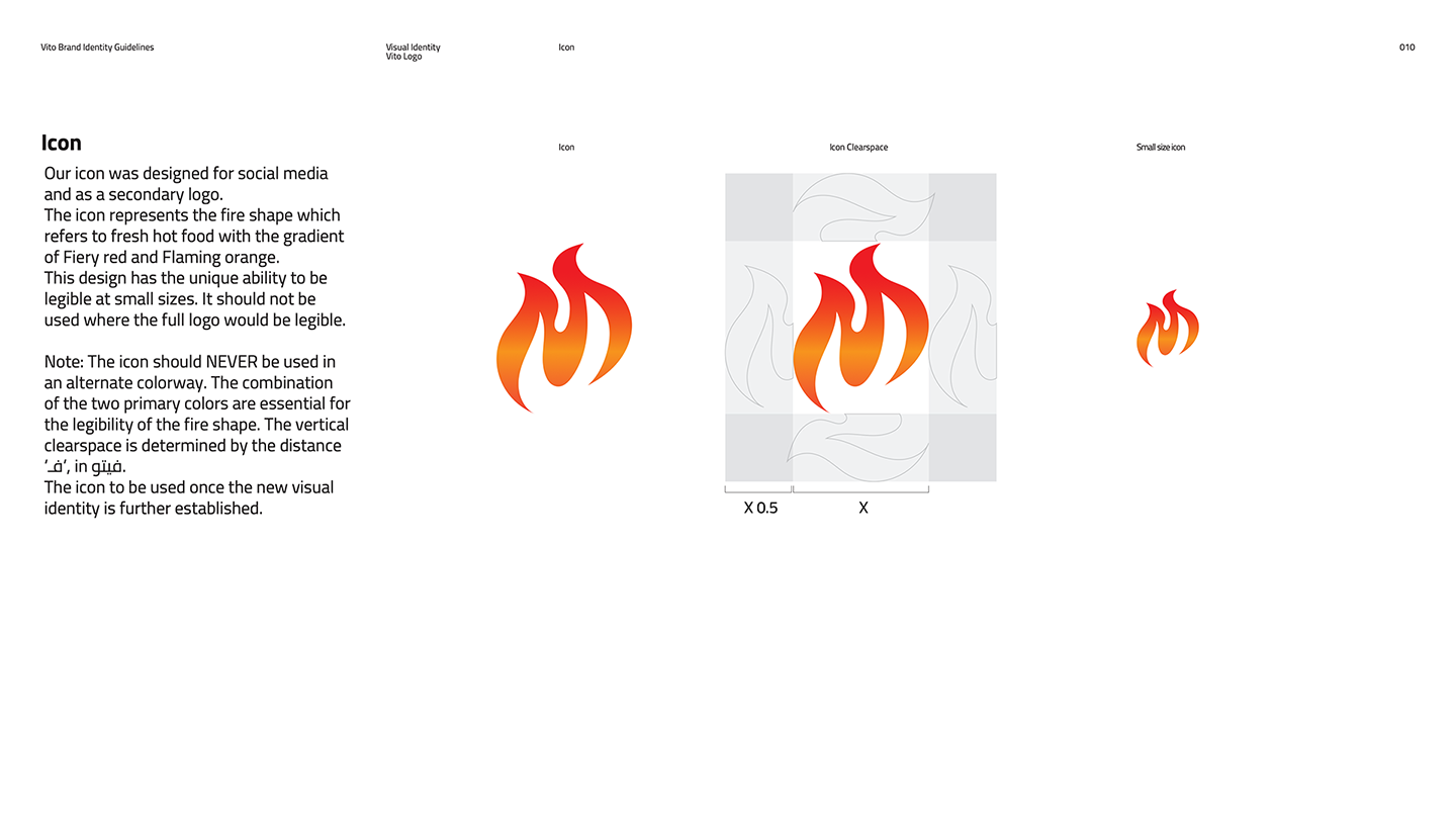
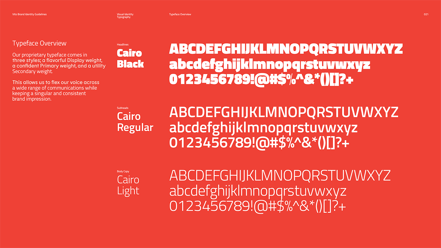
The brand book holds the logic from logo to letter form. A kit of parts that earns its place, the icon clearspace rules, the color system weighted by use, and a giant headline page that says the brand voice out loud. Quality. Fresh. In Cairo Black at full volume.

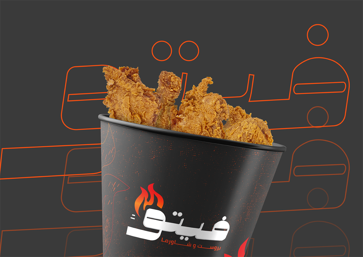
On the table, in the pocket.
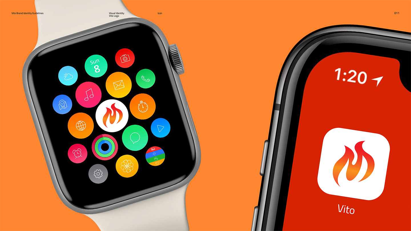
The system carried into every touchpoint that mattered. A delivery bag in kraft and flame. A chicken bucket built to be photographed. And a watch face that turns the icon into a tap target, because even a shawarma brand has a phone these days.


If you’re building a brand worth standing for, we’d like to hear about it.
The fastest way to start is a 30-minute conversation about what you’re working on. No deck, no pitch.