WATERWAY “THE CAPITAL WAY”
Residential and commercial, set in steel.
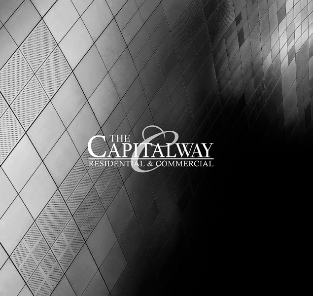
We led the brand identity and brand book design for The Capital Way, Waterway's residential-and-commercial tower in the New Capital. The system is set in steel and shadow, all geometric metal cladding shot in black and white, the wordmark placed where the architecture asks for it. The book is the calling card the developer hands a buyer before the building lets them in.
- Brand Identity
- Brand Book Design
- Print Materials
Set in steel and shadow.
We built the brand around the building's own material: a diamond-patterned metal facade, shot in black and white, the wordmark sitting exactly where the light bends. The mark feels architectural before it feels graphic.
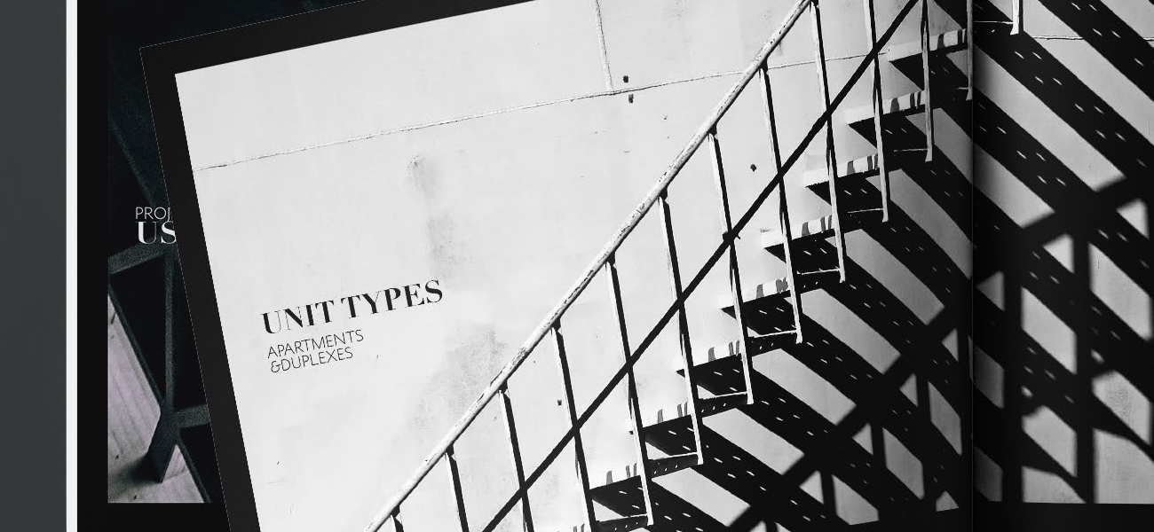
The book, page by page.
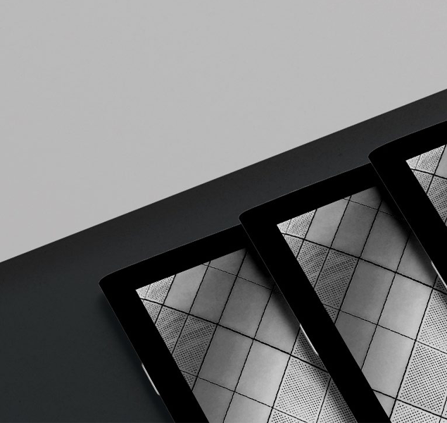
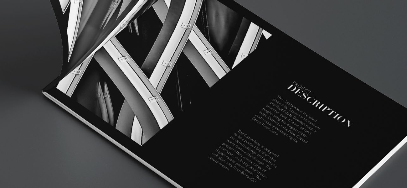
The brand book moves the same logic from cover to content. Stacked covers from the top of the deck, an architecture-led description spread in the middle, and a unit-types section that holds the same monochrome austerity at the back. Quiet pages for a confident piece of property.
If you’re building a brand worth standing for, we’d like to hear about it.
The fastest way to start is a 30-minute conversation about what you’re working on. No deck, no pitch.