Orbit Holding
Six businesses. Dozens of developments. One of Egypt's most diversified groups.
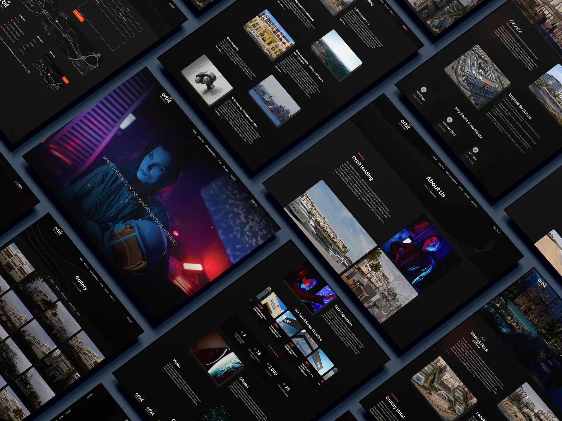
Orbit Holding is one of Egypt's most diversified groups: 6.5 billion EGP of capital investment behind six businesses spanning real estate, construction, hospitality, property and facility management, agriculture, and trade, with dozens of developments reaching from the Red Sea coast to Cairo, the North Coast, and Luxor.
We crafted Orbit's brand language and designed and developed the website. The whole identity takes its cue from the name itself: an orbit, the celestial path a body traces around a center. Six businesses circle one parent, held by a single gravity, and the site brings that system into one coherent experience, from the center outward to every subsidiary and project.
- Brand Strategy
- Brand Language
- Design System
- UX & UI Design
- Web Design
- Development
- Content System (CMS)
- 2.1M
- views since launch
- 20K
- new leads
- +250%
- rise in visitors
- +90%
- rise in engagement
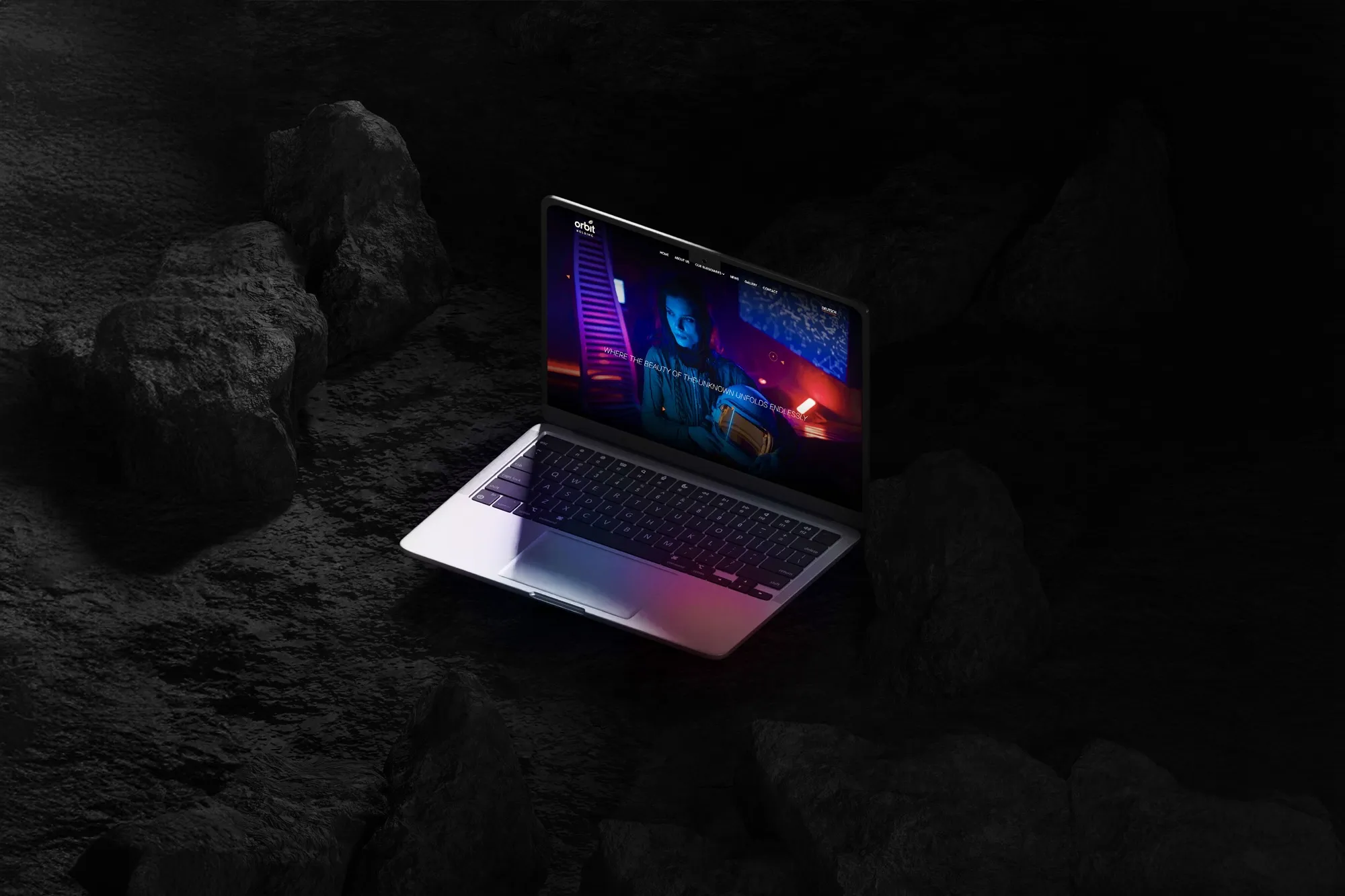

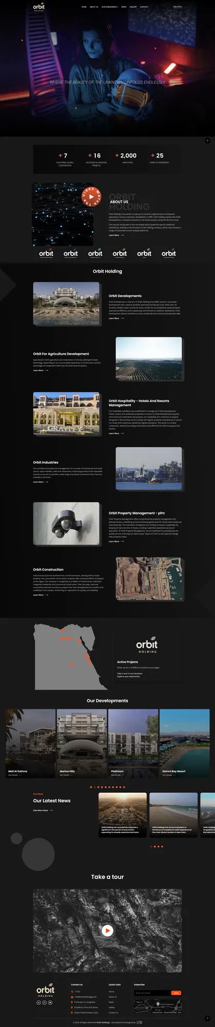
Entering the world of Orbit
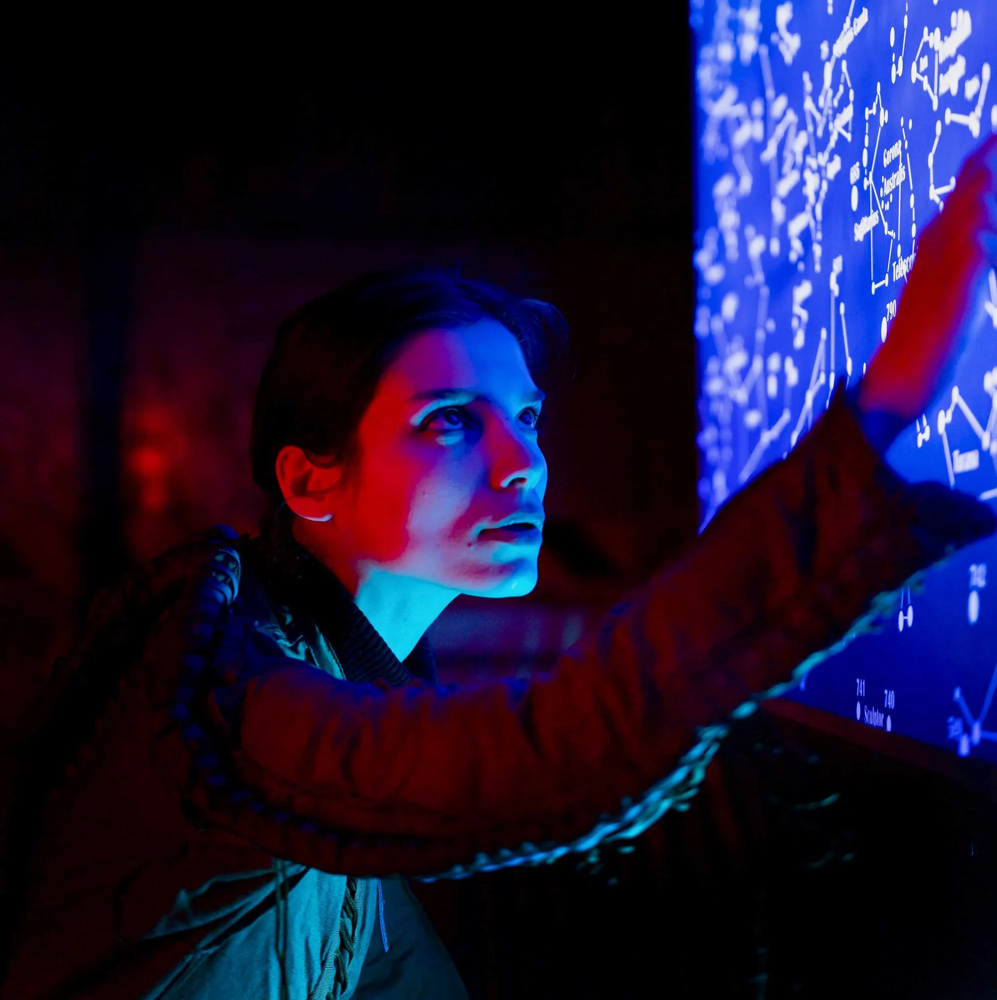
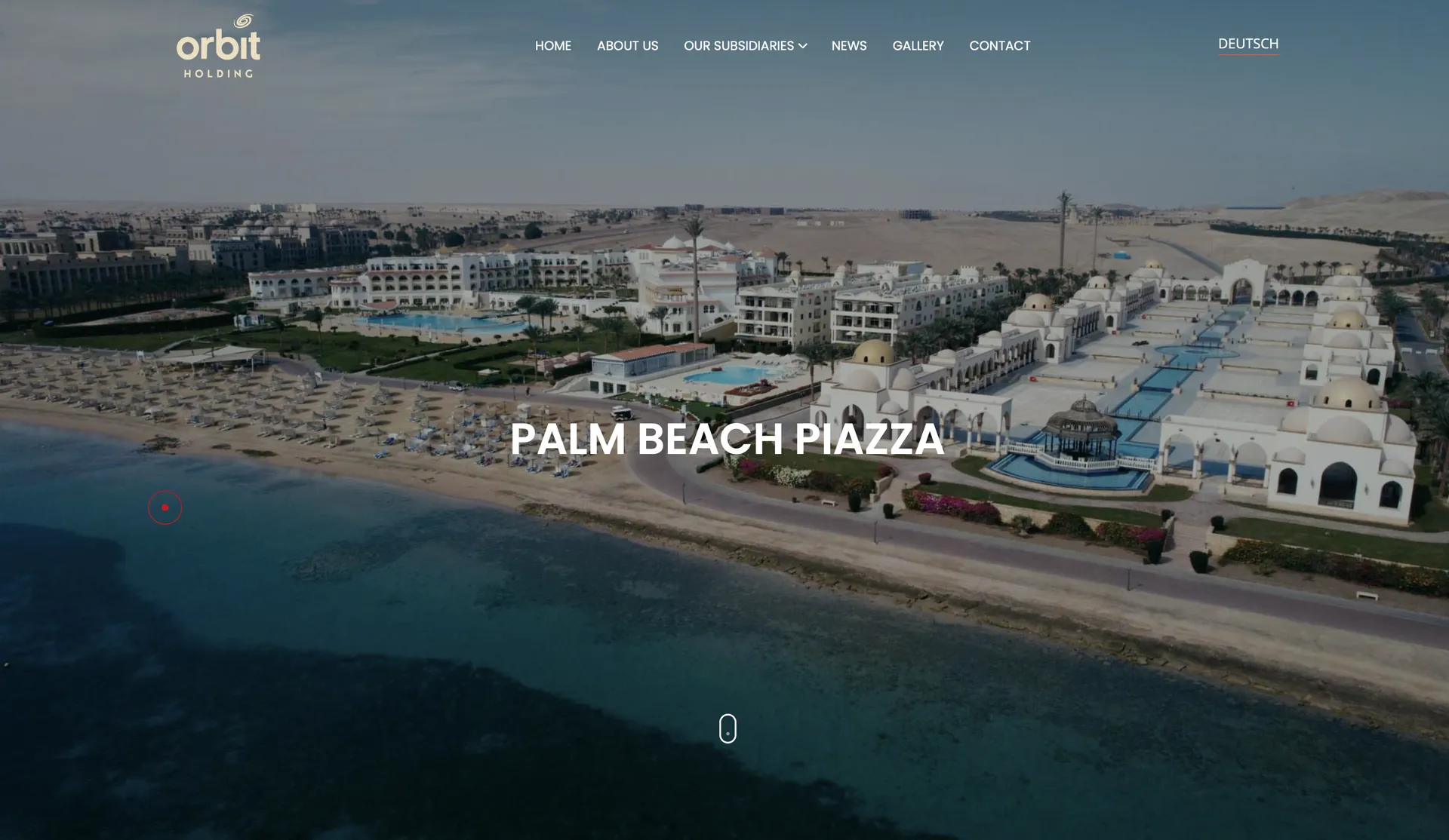
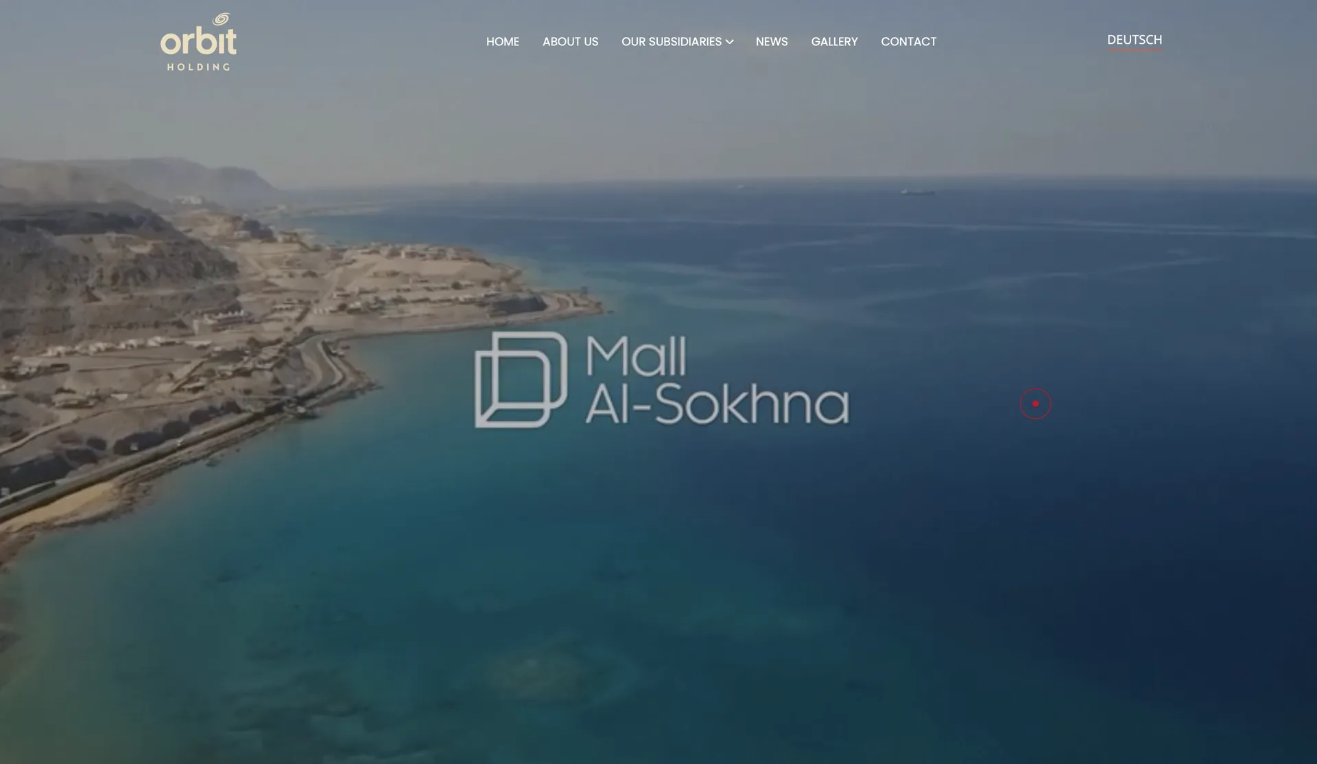
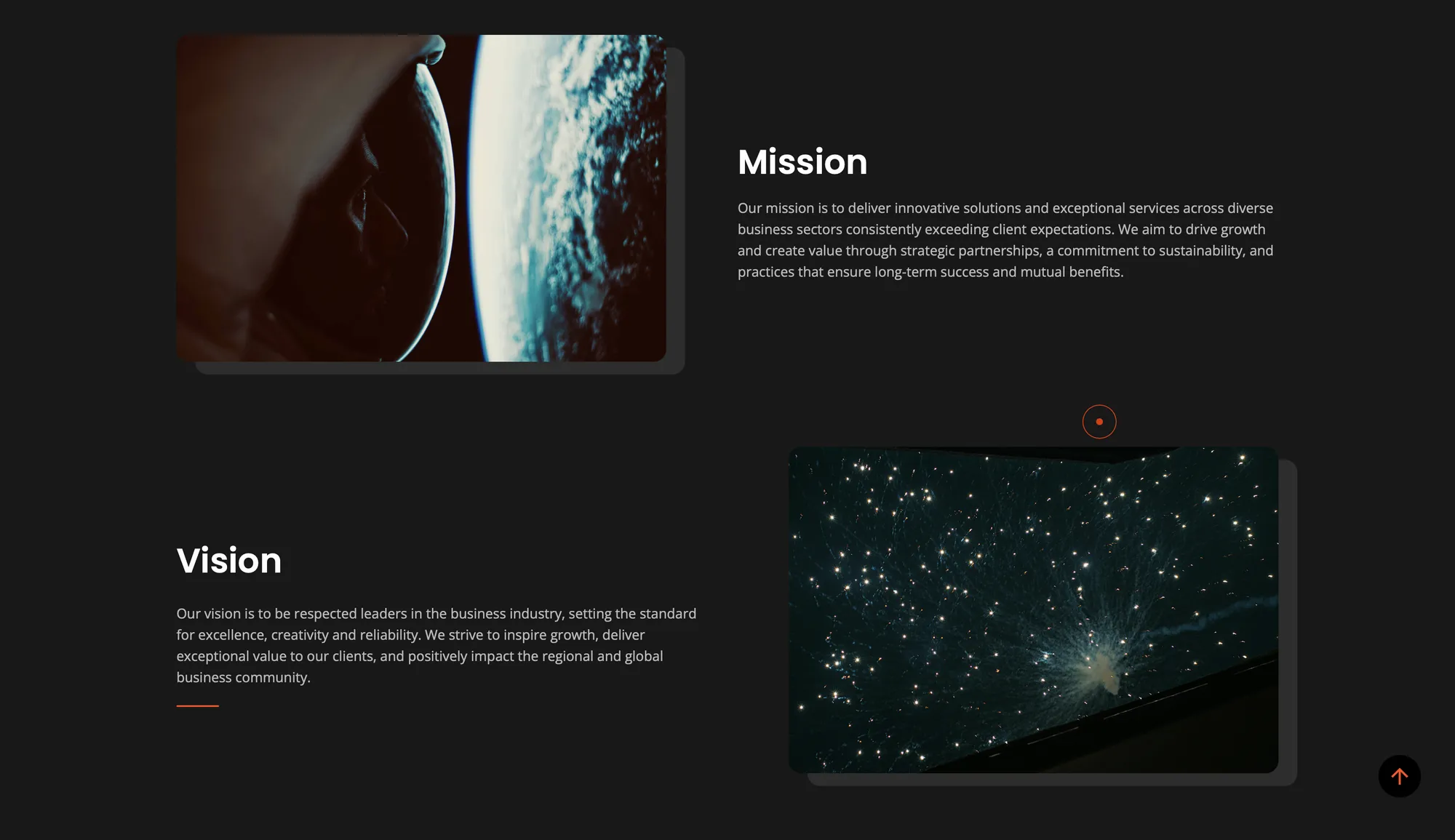
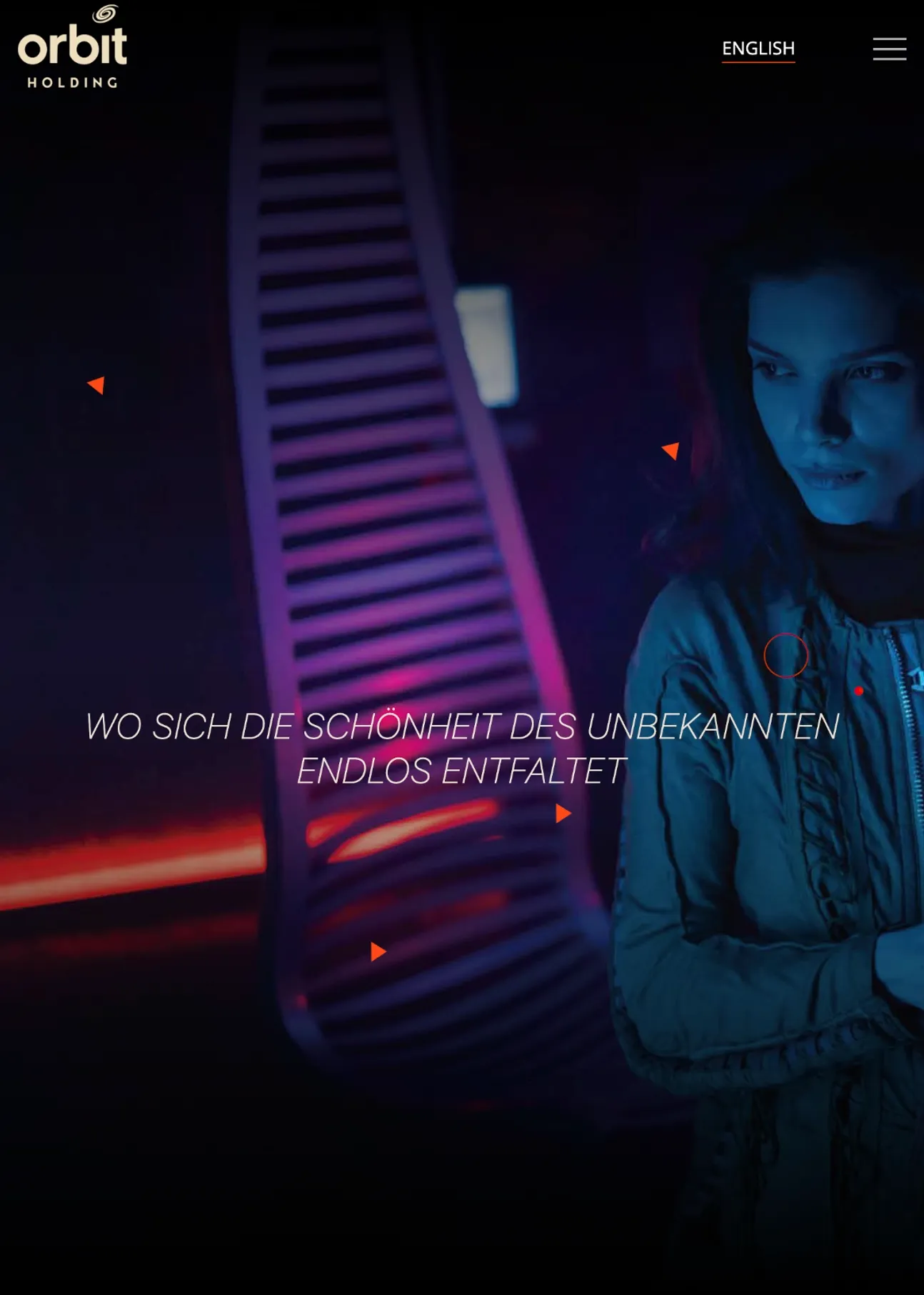
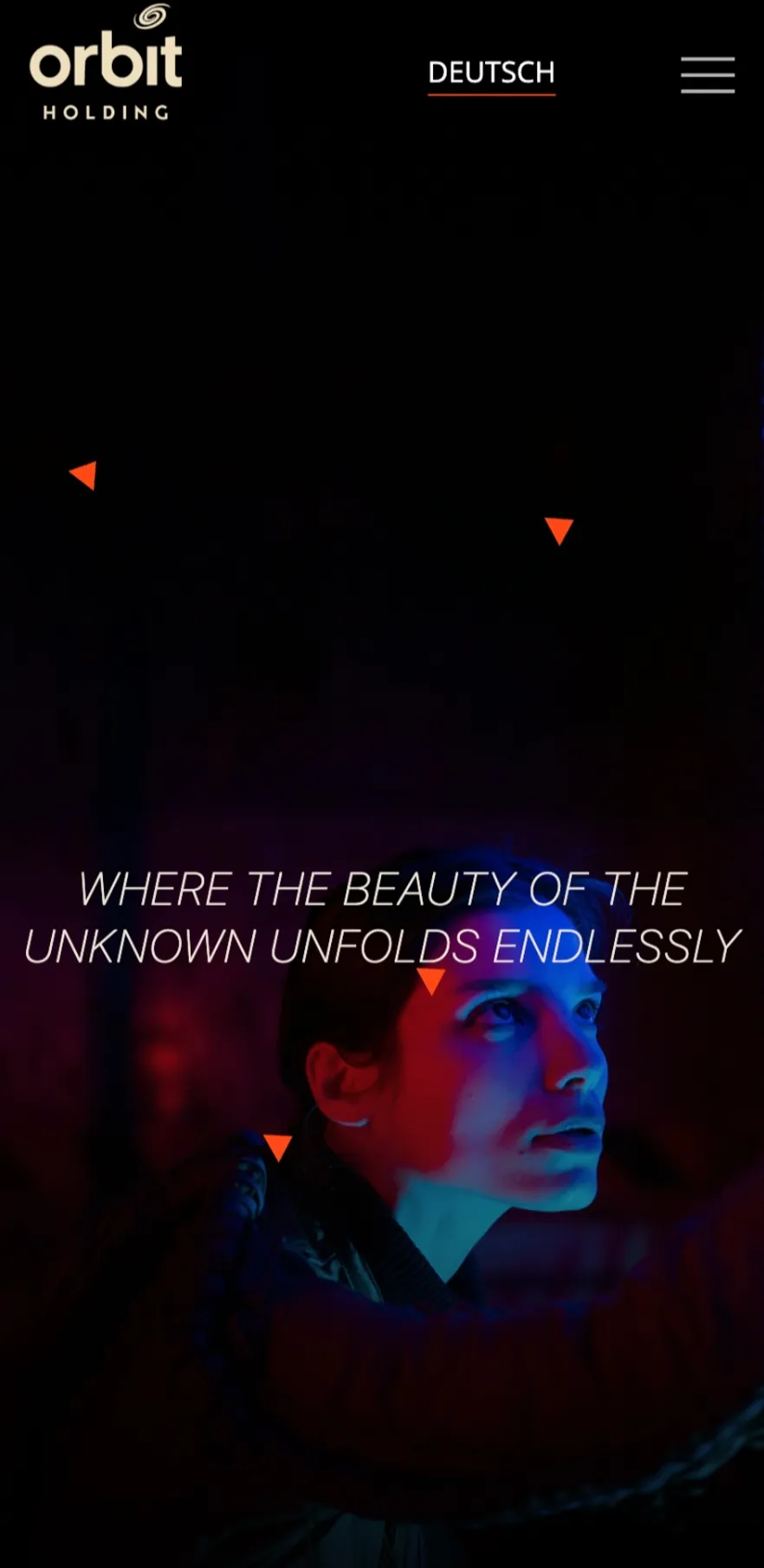
Orbit's story begins on the Red Sea coast and never stops moving outward. We opened the site on that idea, the brand line "where the beauty of the unknown unfolds endlessly", and built a guided path that draws you in from the parent group and out into each of its six businesses, the way a body enters an orbit.
The scale of Orbit becomes something you travel through, not just read about.
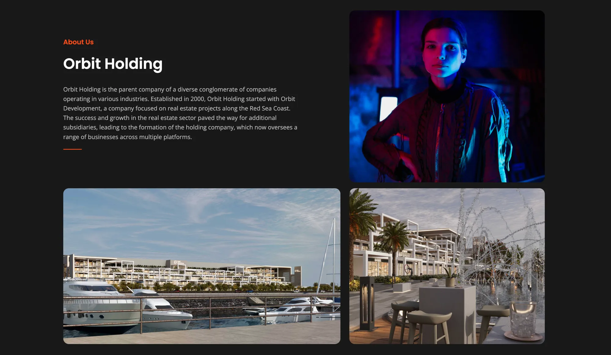
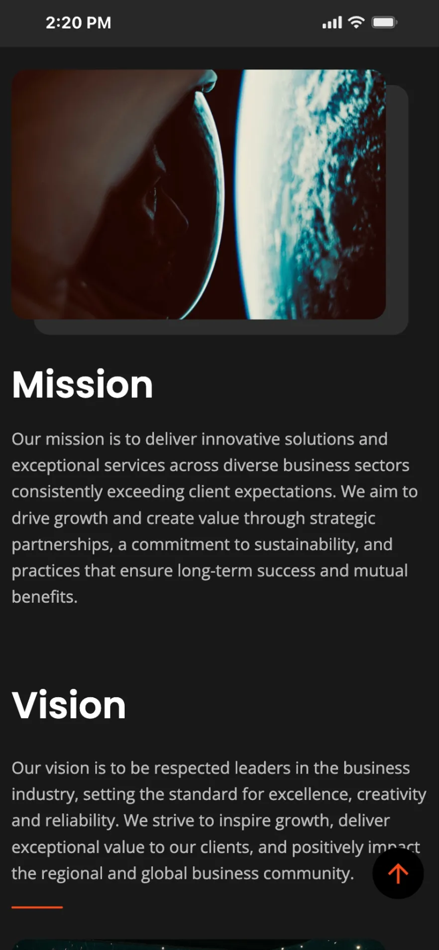
One group, six businesses,
one signature
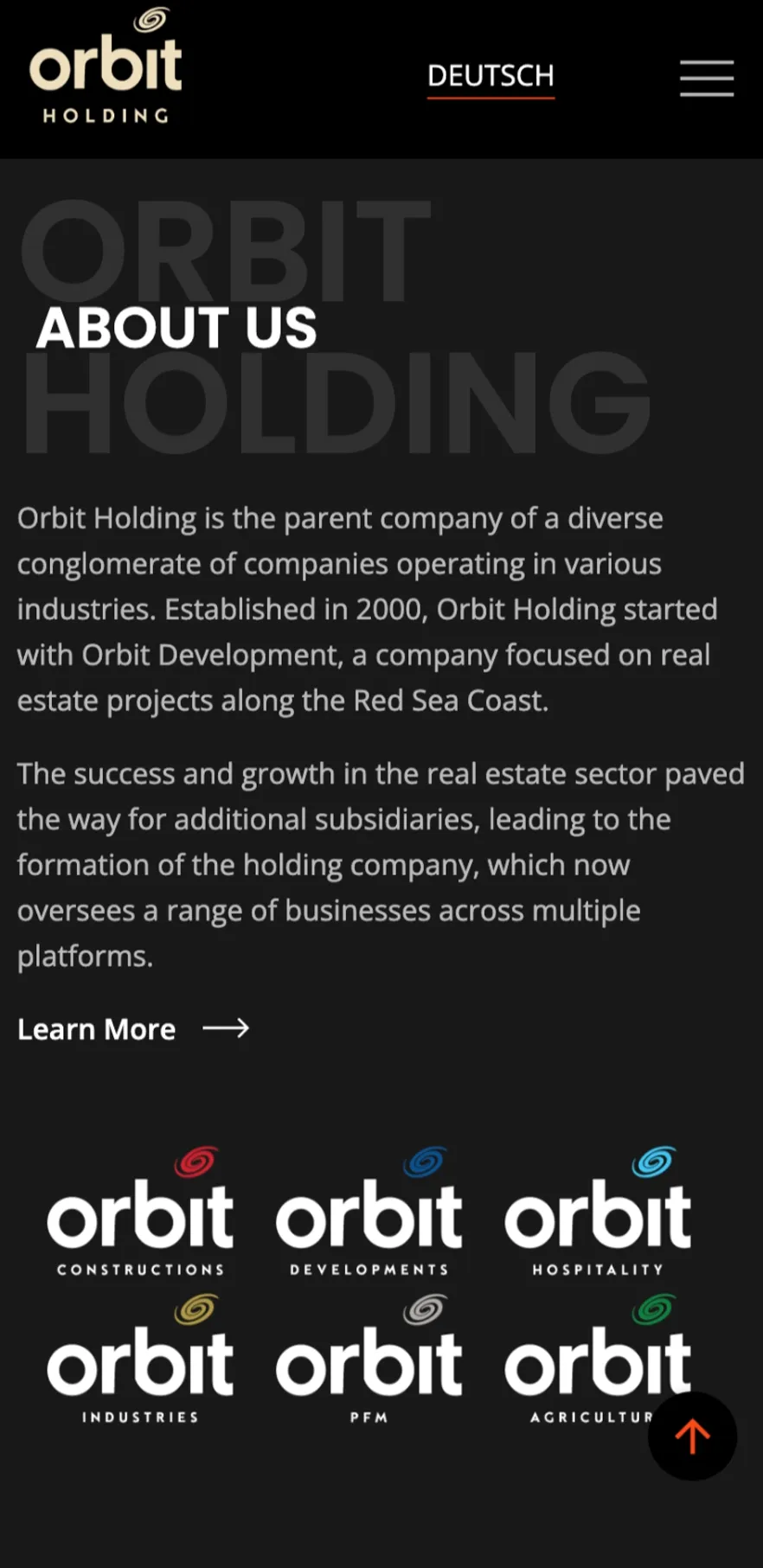
A holding company lives or dies on coherence, so we treated coherence as gravity. Construction, Developments, Property and Facility Management, Hospitality, Agriculture, and Trade each trace their own orbit while held to one center.
Every one keeps its own identity and stays unmistakably Orbit, presenting the group as one credible, investable whole to partners, buyers, and talent.
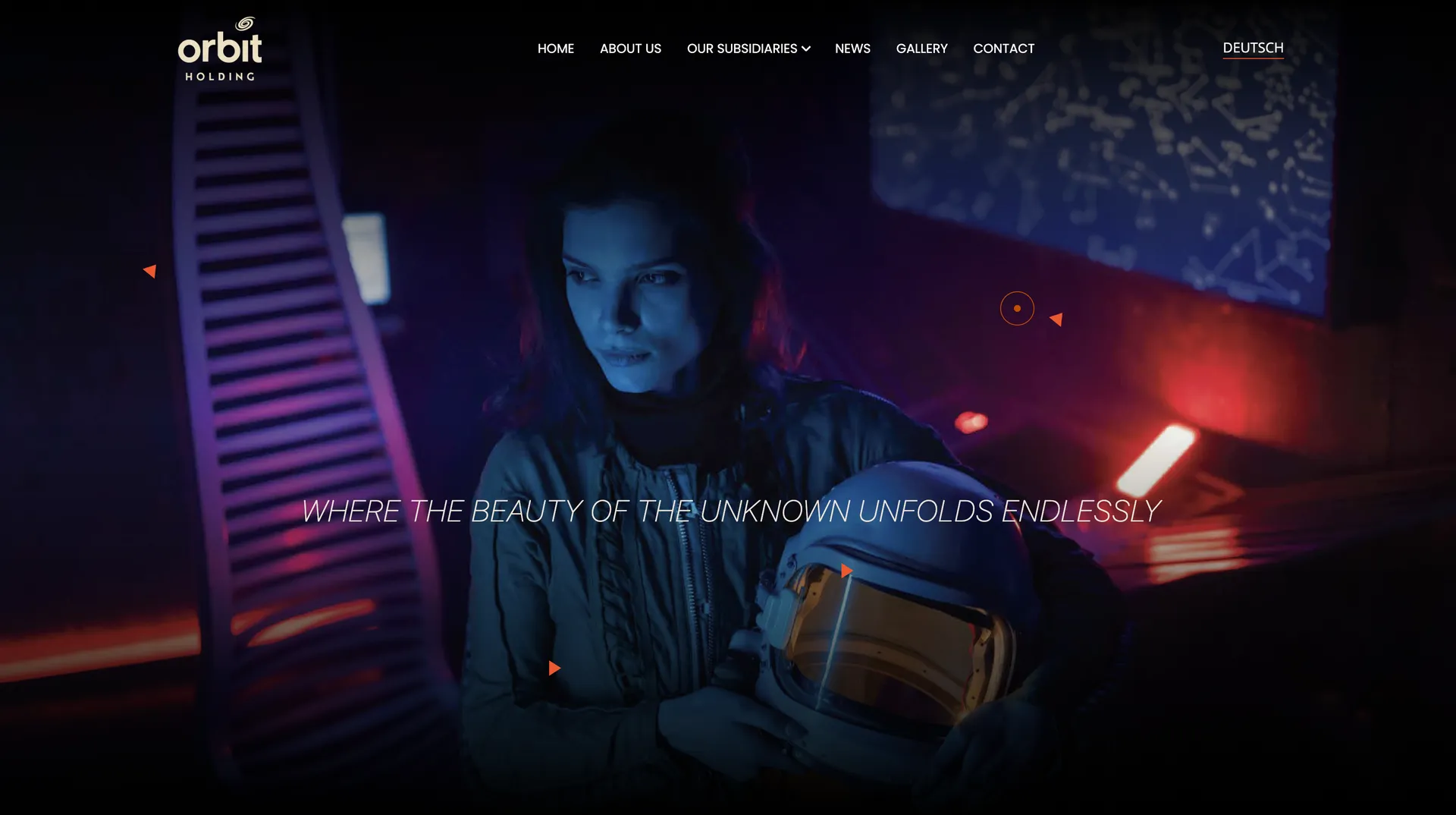
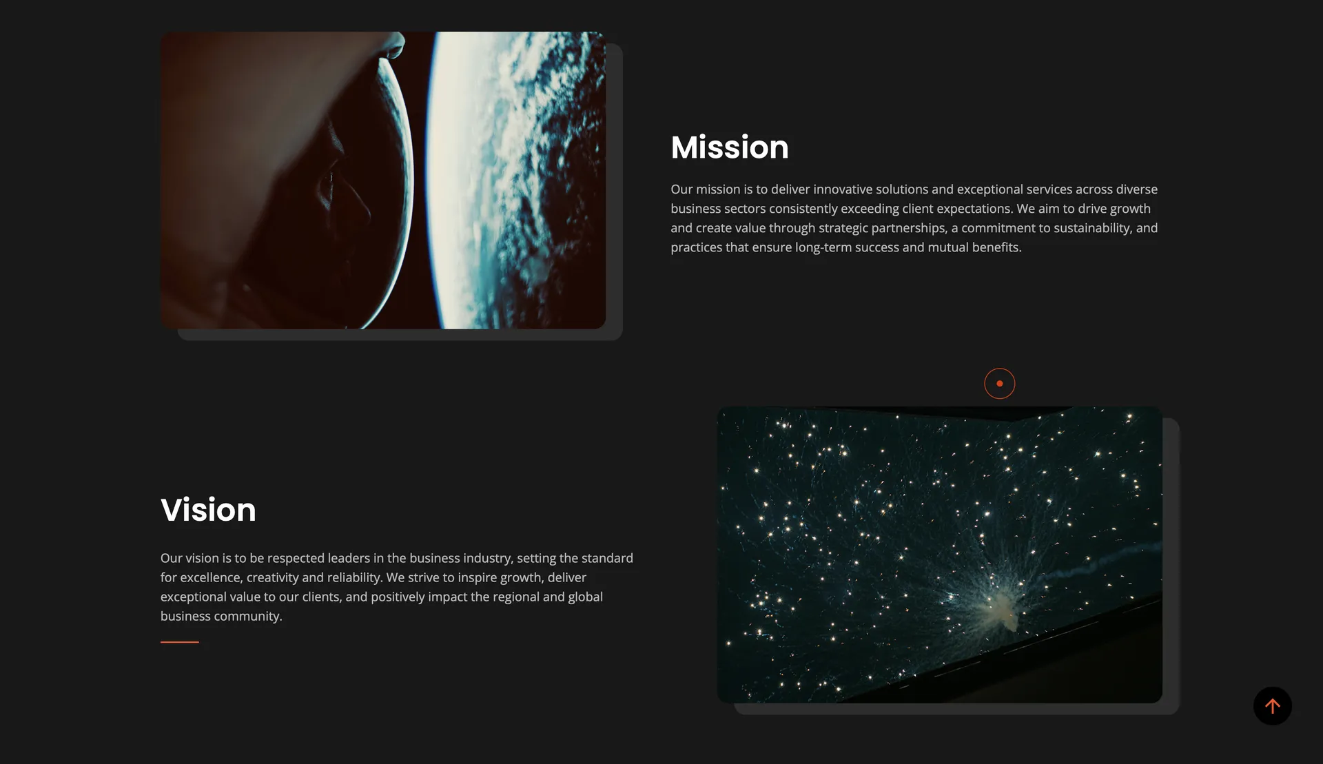
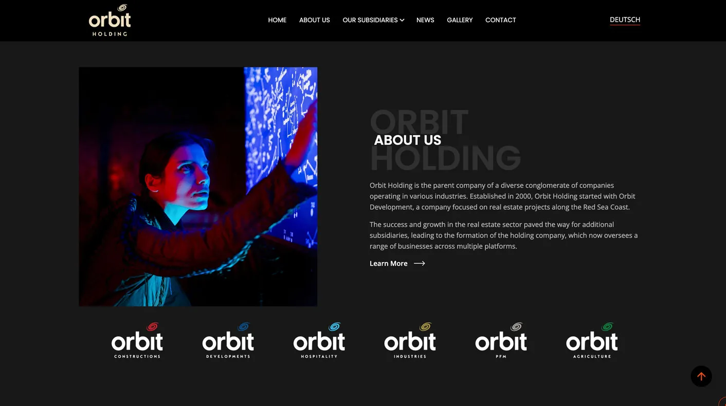
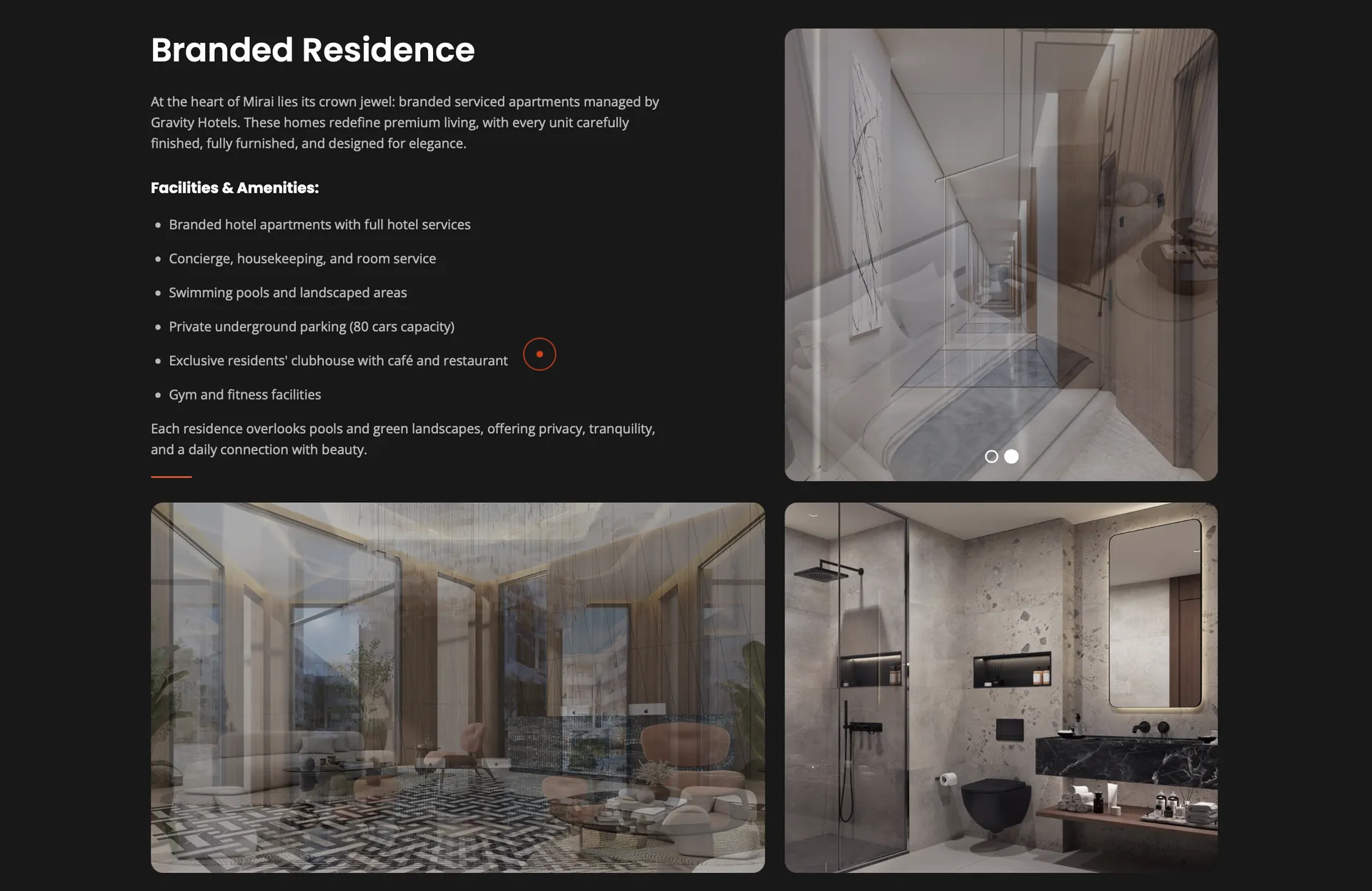
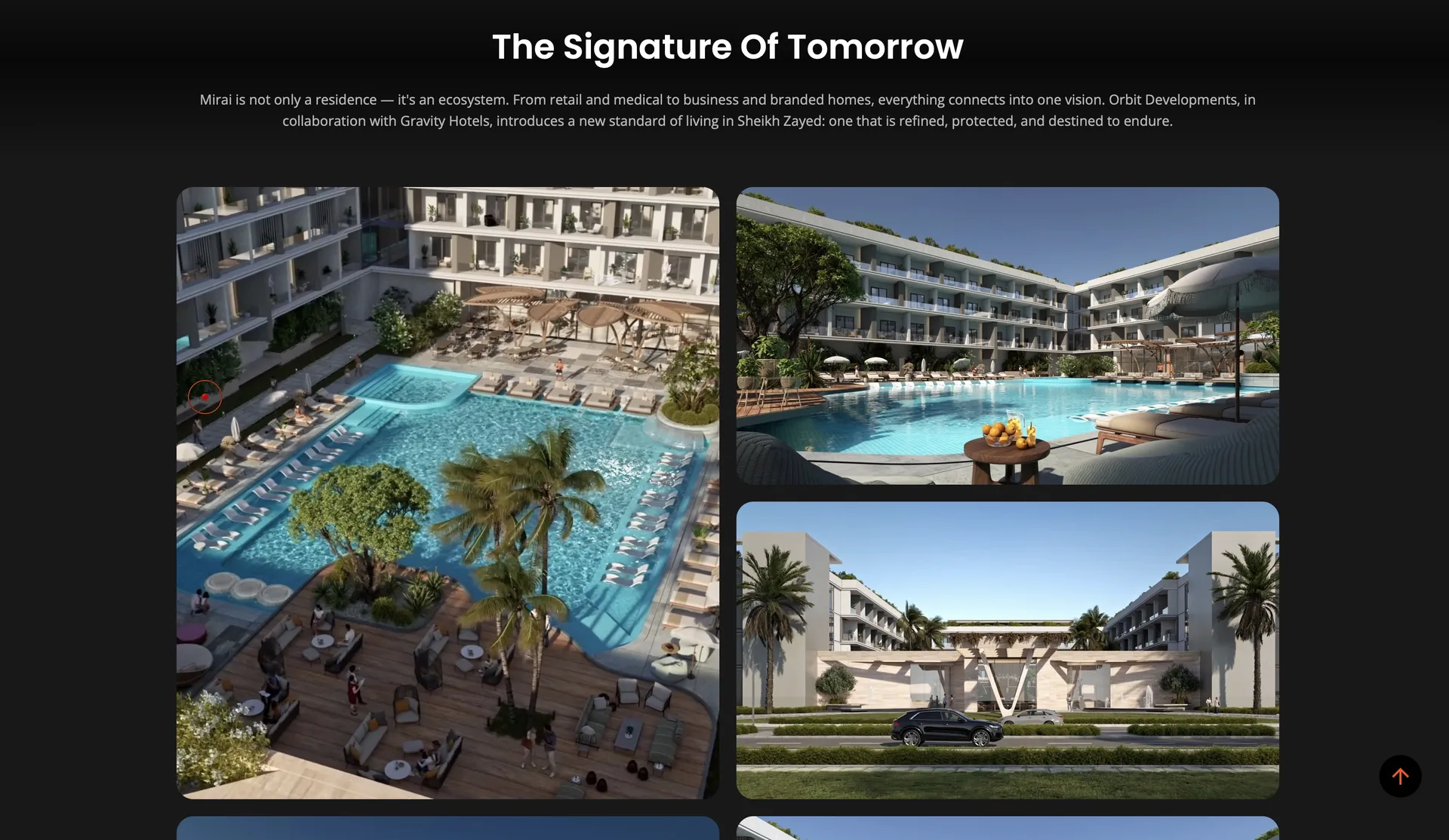
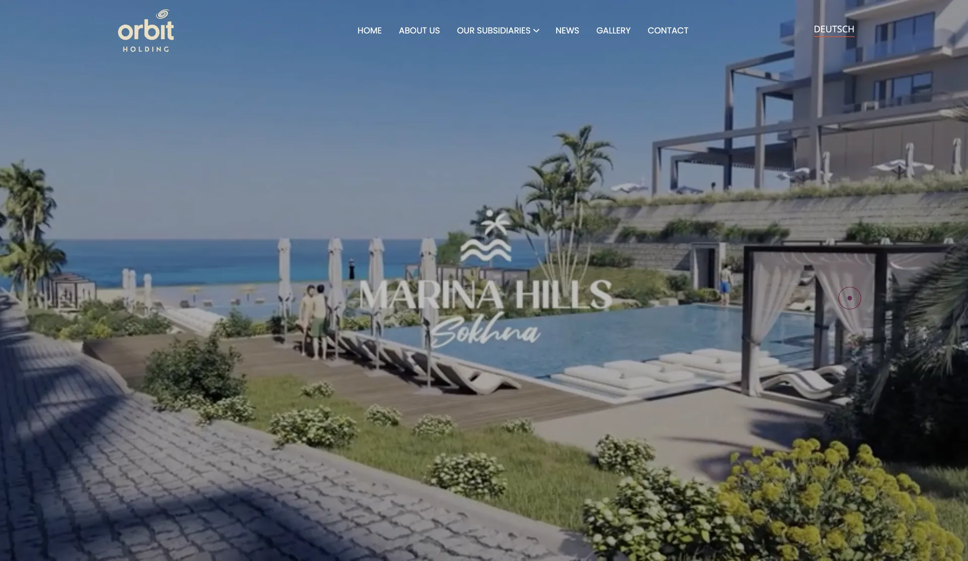
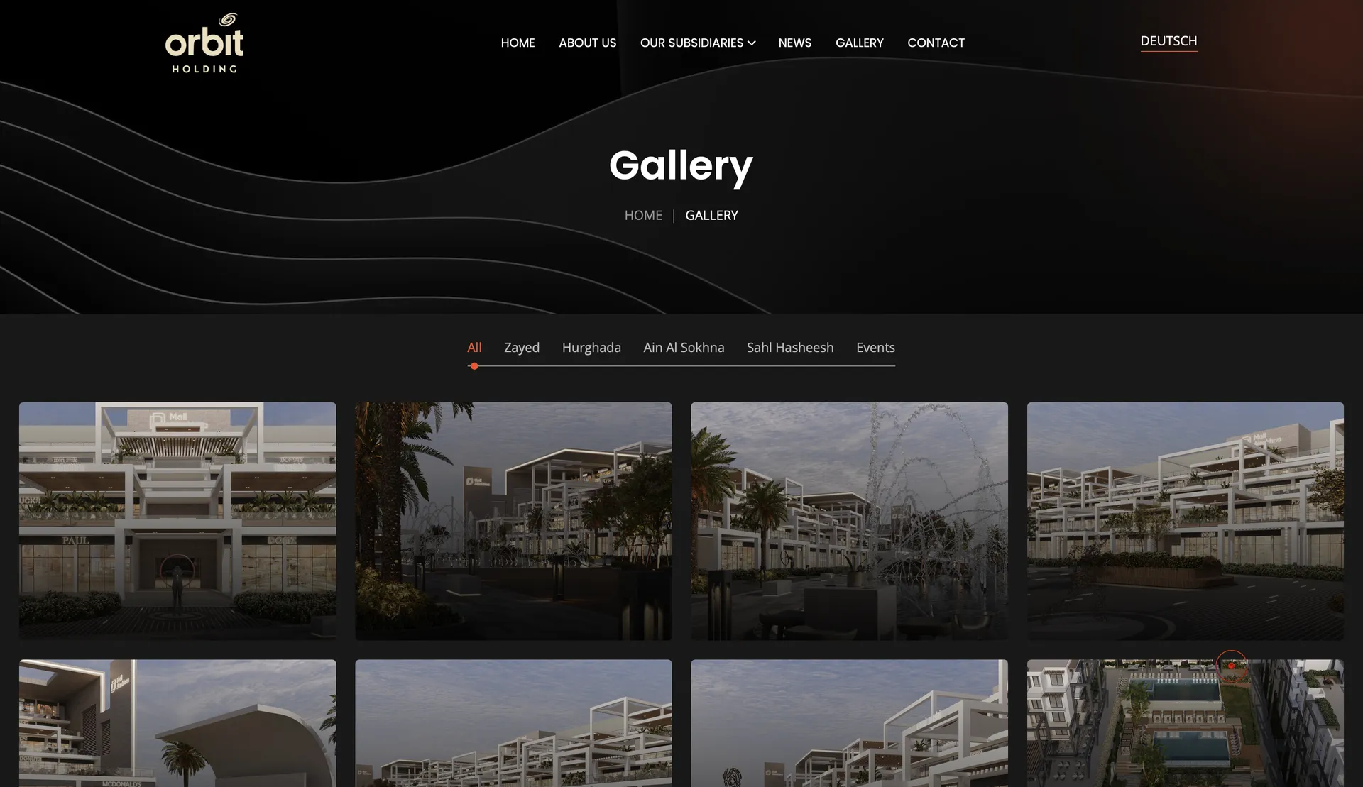
A visual language for Orbit
Orbit's visual language is inspired by the name itself: the orbit, the celestial path a body traces around a center. Rings, motion, and gravity shape the system, with a palette pulled from deep space and the Egyptian horizon, a confident type system, and a logo architecture that sets every subsidiary in its own orbit inside one family.
It is the thread that lets a real estate developer, a hotel group, and a trading company read as a single brand.
Type anchors the system: one expressive display face, used with restraint across the family.
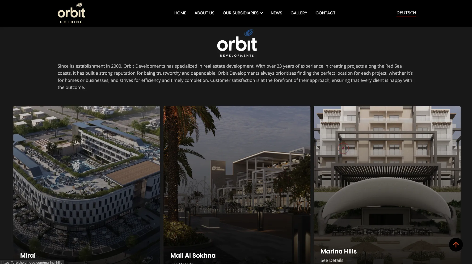
Every project, a world of its own
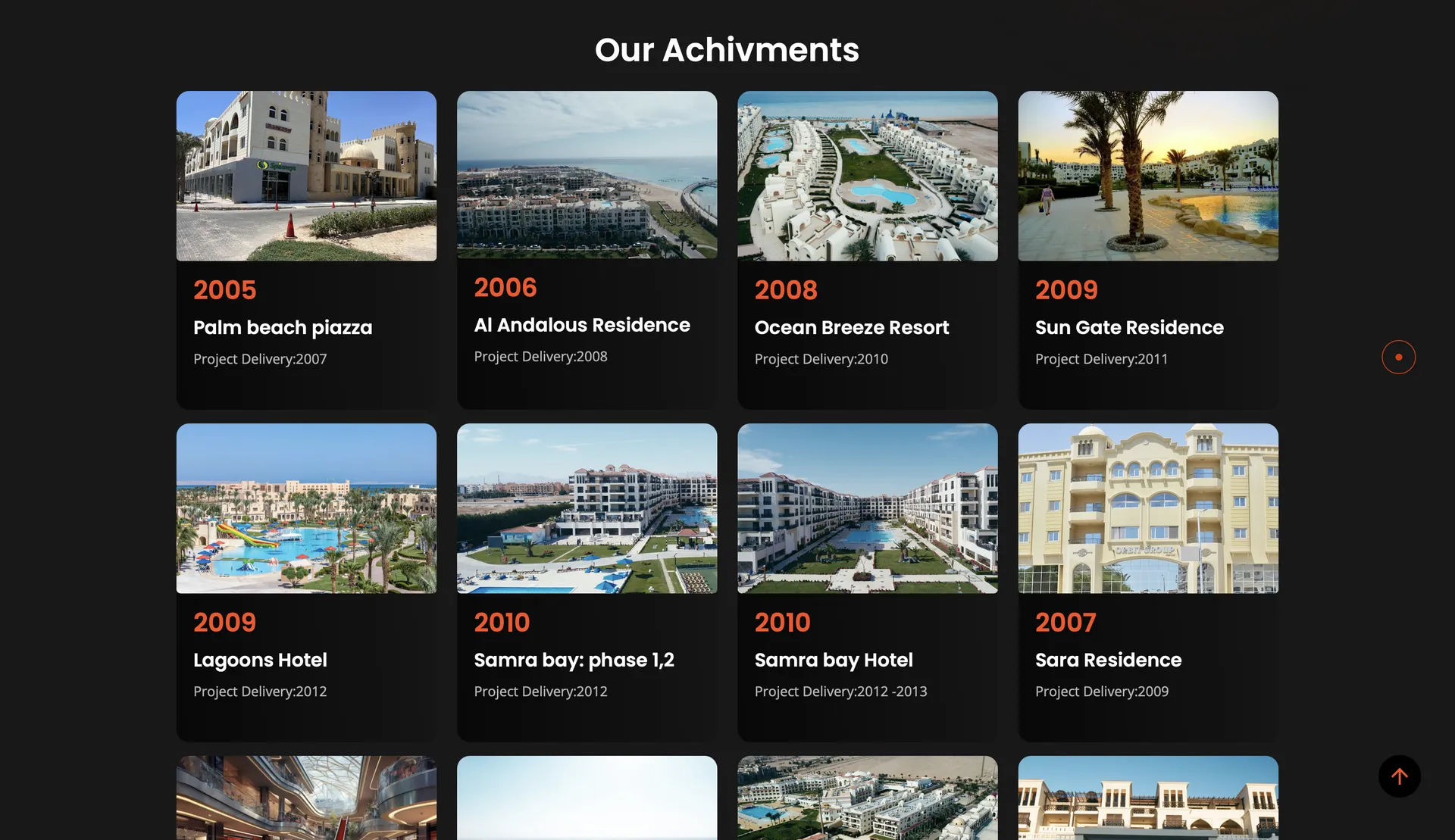
Beneath the group, each development is a world of its own. We built a flexible project template that carries a place from concept to detail: the seashell idea behind Mirai, the stats, the renderings, the amenities.
A single residence or resort feels as considered as the system above it.
Built to grow without breaking
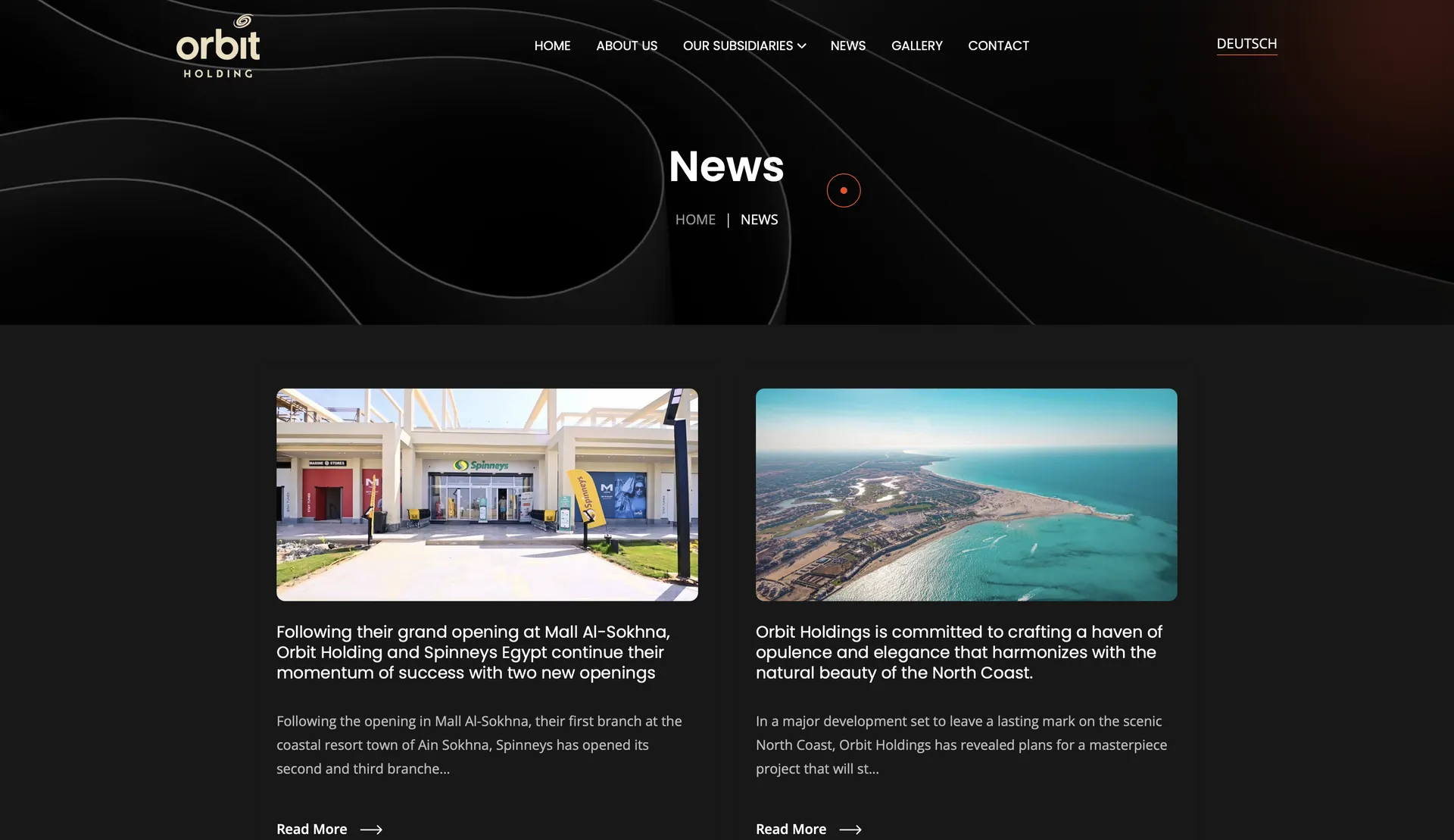
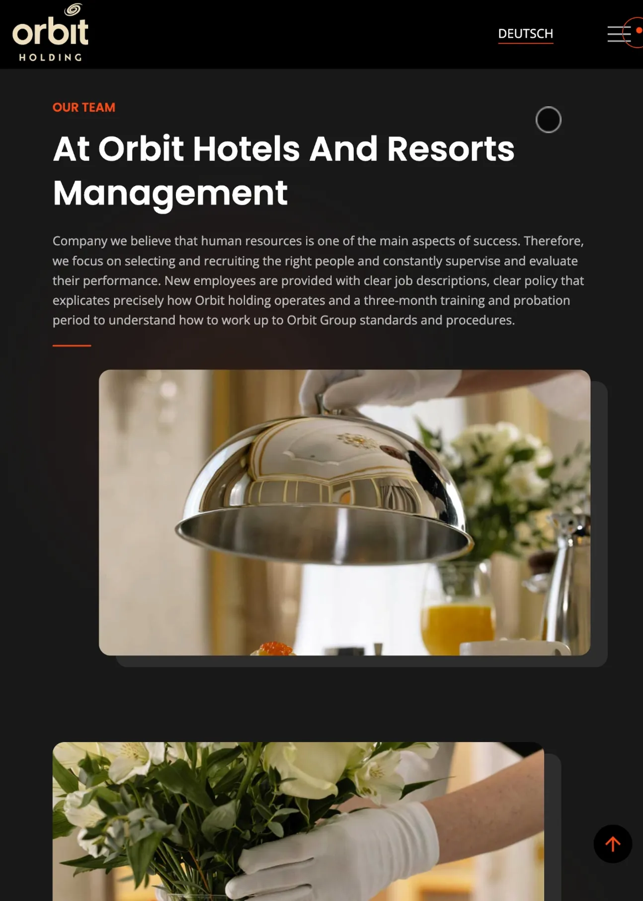
Orbit keeps adding: new projects, new businesses, news, galleries, in two languages. So we built a modular content system the team runs themselves, where every project, subsidiary, and post is a new body that slots into the system without a redesign.
We designed it, built it front to back, and host and maintain it on our own servers.
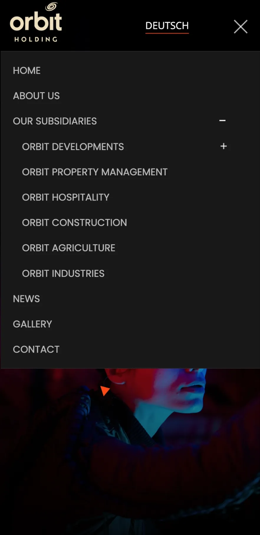
We handed Orbit the keys, not a dependency.
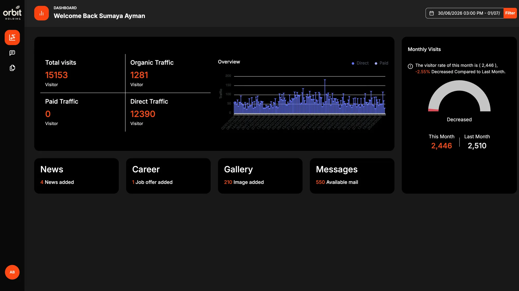
A website you cannot update is a liability. So we did not give Orbit a site they would have to call us to change, we built them a custom admin panel and handed over the controls. Their team publishes developments, news, galleries, and careers, edits the homepage, and answers enquiries themselves, in both languages, without touching code. A built-in dashboard tracks traffic and engagement, so the people running Orbit can see how the site performs and act on it.
Speak to every buyer in their own language.
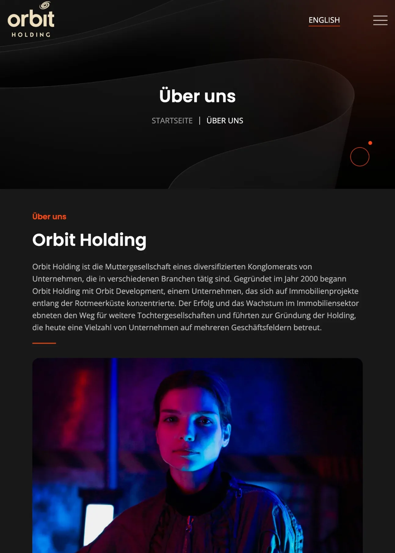
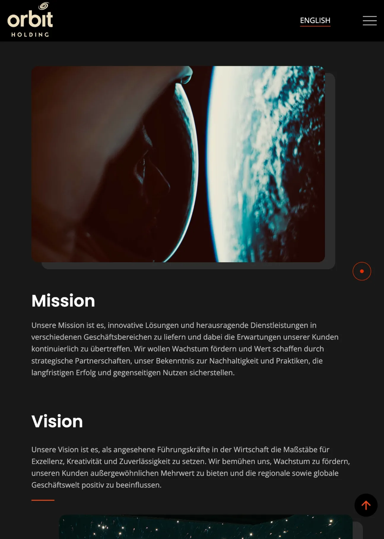
Orbit's coast sells far beyond Egypt, and a large share of its Red Sea and North Coast buyers speak German. So we did not treat translation as an afterthought. We built the site bilingual from the structure up: English and German as equals, every project, subsidiary, and news post written once and read natively in both. The brand language keeps its voice across the switch, so a buyer in Munich meets the same Orbit as a buyer in Cairo.
A platform built to last
The result is a digital home that matches Orbit's ambition: one brand language across six businesses and dozens of projects, in English and German, a system built to keep expanding, ready for the next world to enter its orbit.
If you’re building a brand worth standing for, we’d like to hear about it.
The fastest way to start is a 30-minute conversation about what you’re working on. No deck, no pitch.