MERAS
Meras. Built on identity.
We led the brand identity for MERAS, a fast-growing interior design office in the Egyptian market. We designed a mark that reads as steady and crafted, then carried it across a full print system of letterheads, business cards, envelopes and folders. The result is a desk-level identity that puts MERAS in conversation with the more senior firms it competes against.
- Brand Strategy
- Logo Design
- Brand Identity
- Print Design
- Stationery System
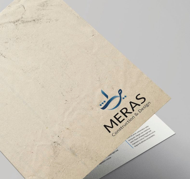
A mark that reads as crafted.
We drew the MERAS wordmark with a steady serif weight and a quiet flourish above the M, a signal of construction sitting on top of design. It reads as patient work, not flashy branding, and gives the office a logo it can grow into.
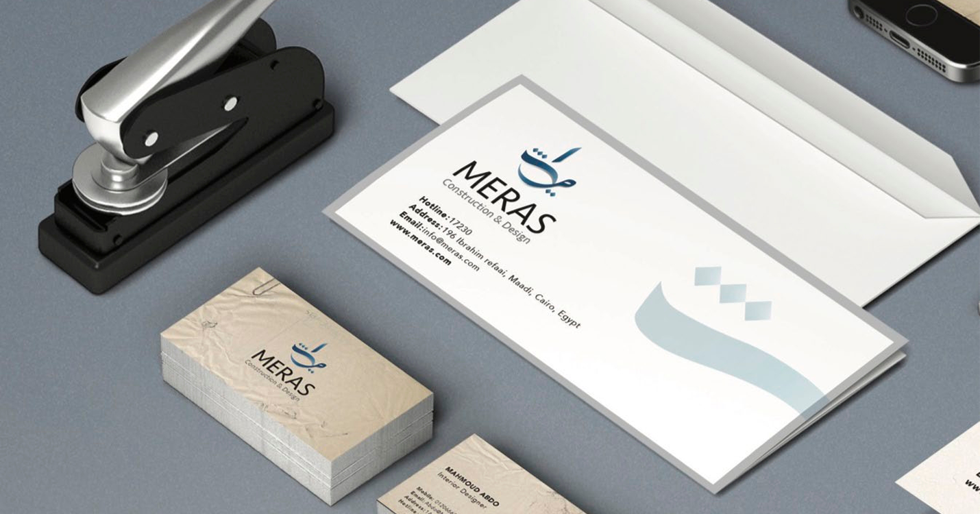
Identity applied across the desk.
We extended the mark into a full print system. Stamps, envelopes, business cards and folders share one quiet palette of warm kraft and deep blue, so every piece a client touches reinforces the same calm authority.
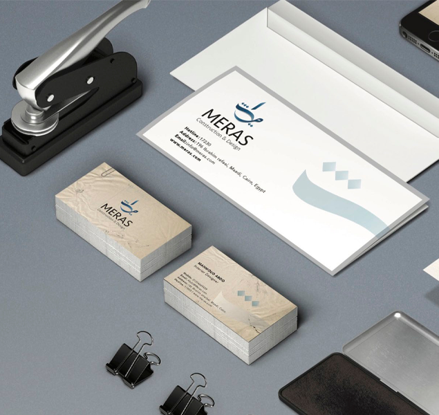
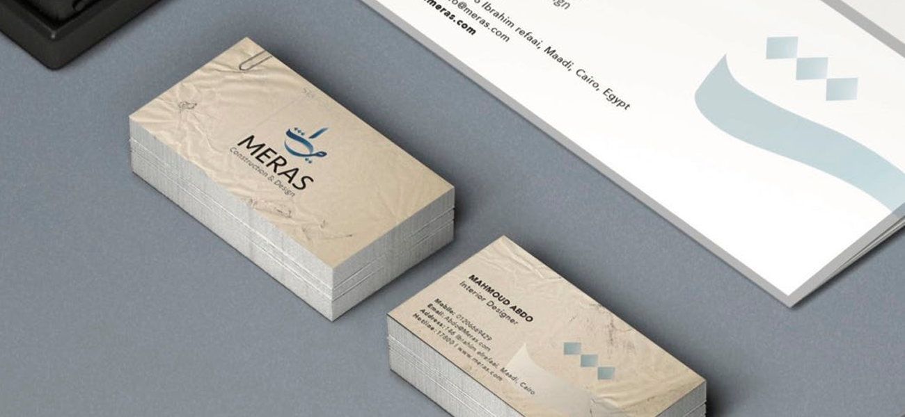
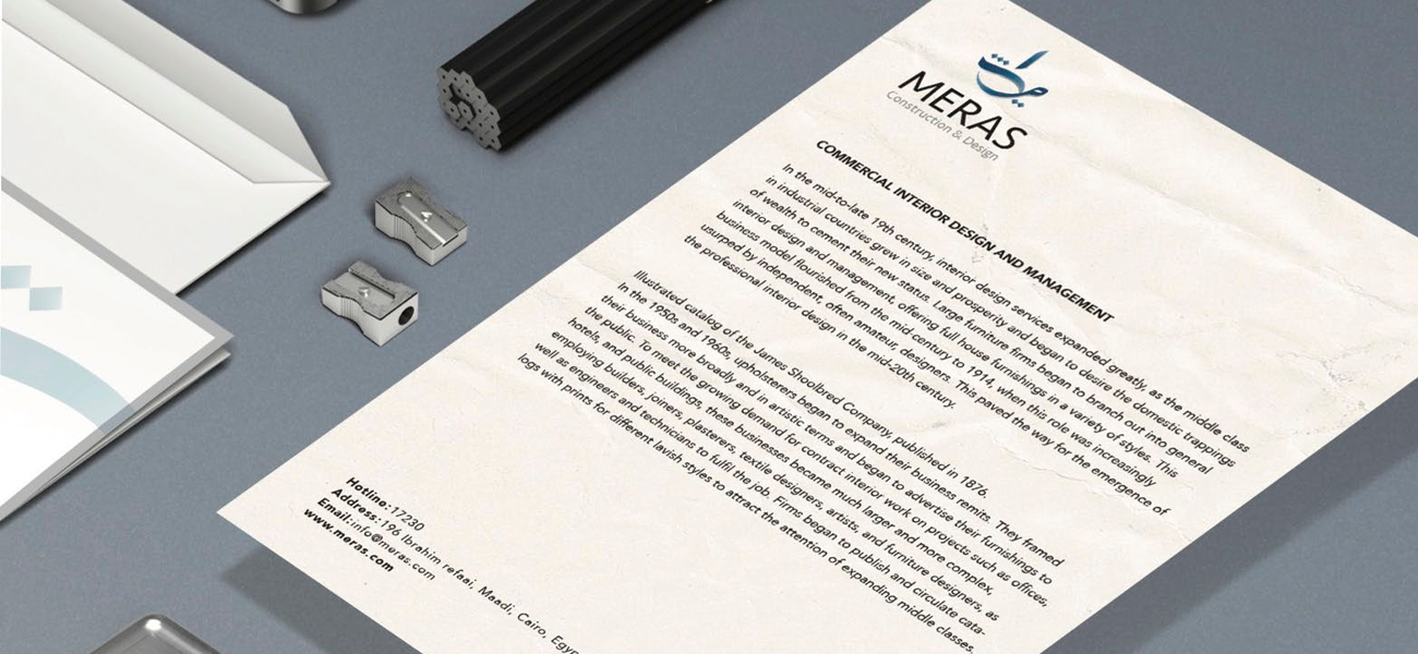
Cards and letterhead, built for the room.
Business cards in textured stock and a letterhead with grounded typography close the system. The pieces feel material first and decorative second, which is exactly how MERAS approaches interior design.
If you’re building a brand worth standing for, we’d like to hear about it.
The fastest way to start is a 30-minute conversation about what you’re working on. No deck, no pitch.