CHICK IN
Fried chicken, the kind worth crossing town for.
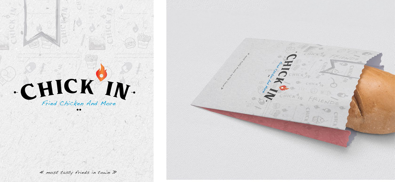
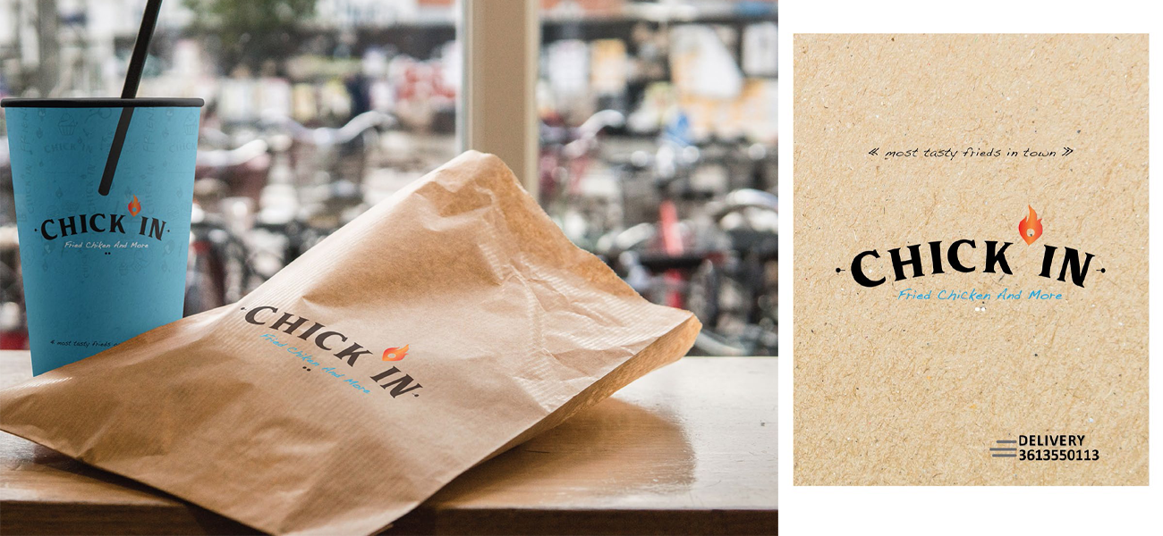
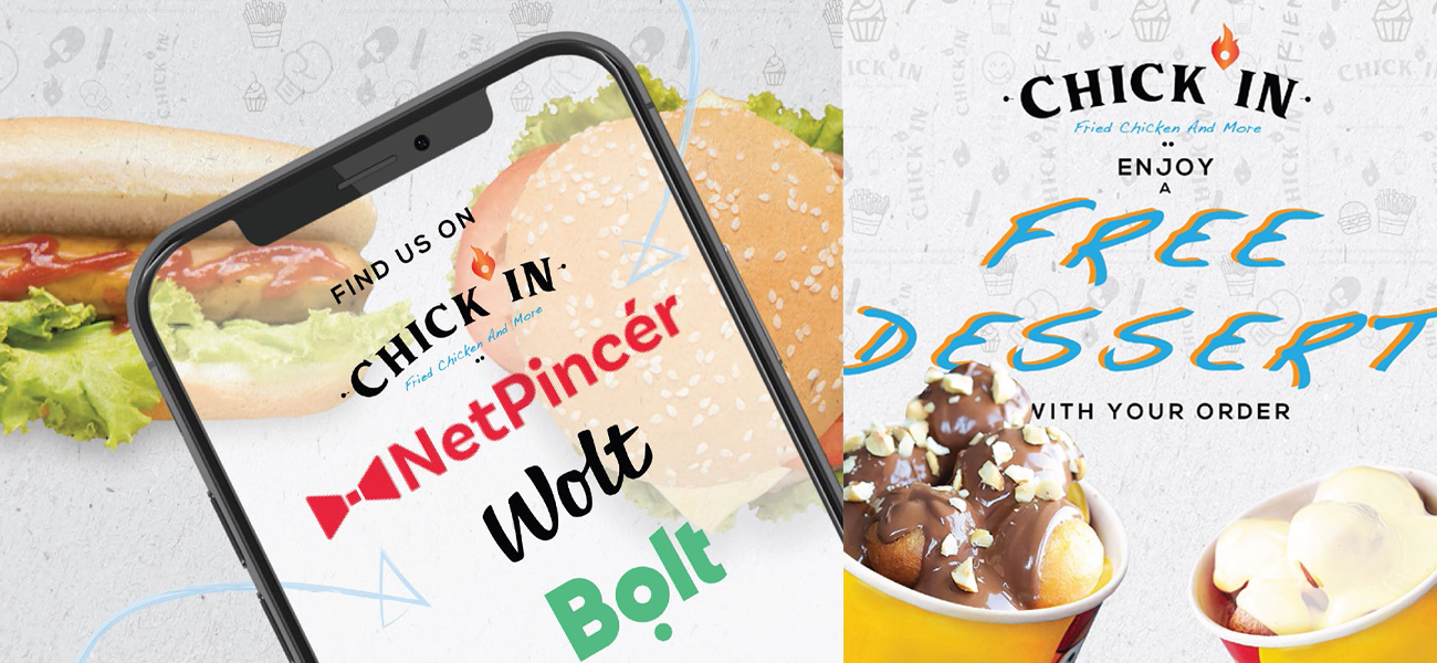
We led brand strategy, identity, and the full launch campaign for Chick In, Budapest. The logotype is a hand-drawn wordmark with a small flame on top, set against a confident sans-serif tagline: fried chicken and more. The system carries from storefront to delivery sleeve to apparel to a NetPincer, Wolt, and Bolt presence built to be reordered.
- Brand Strategy
- Brand Identity
- Packaging Design
- Advertising Campaign
Fried chicken and more.
We built the brand around a small bilingual gesture: a hand-drawn wordmark, a flame where the apostrophe should sit, and a sans-serif line under it that says the rest. The mark feels familiar before it feels new, which is the trick a fried-chicken shop in Budapest actually needs.
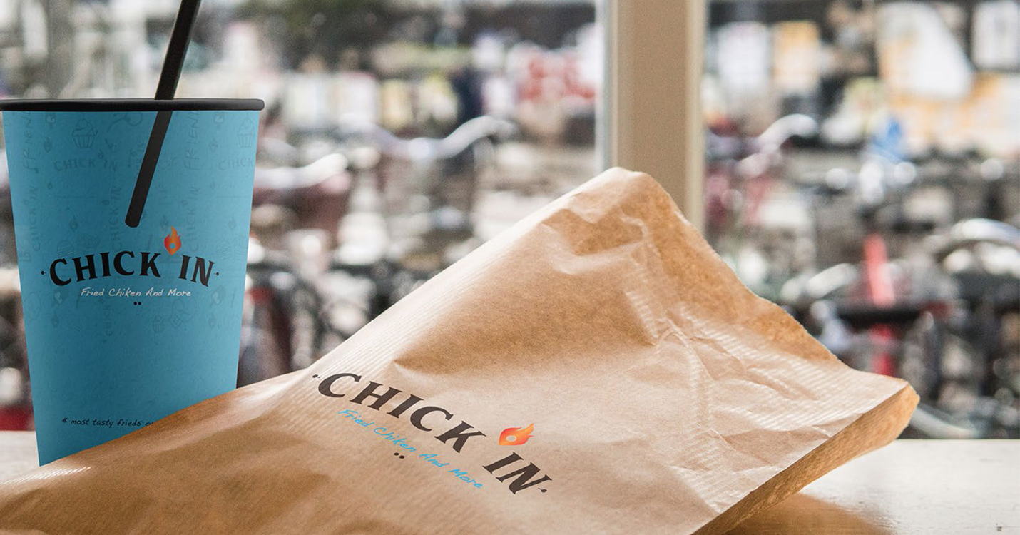
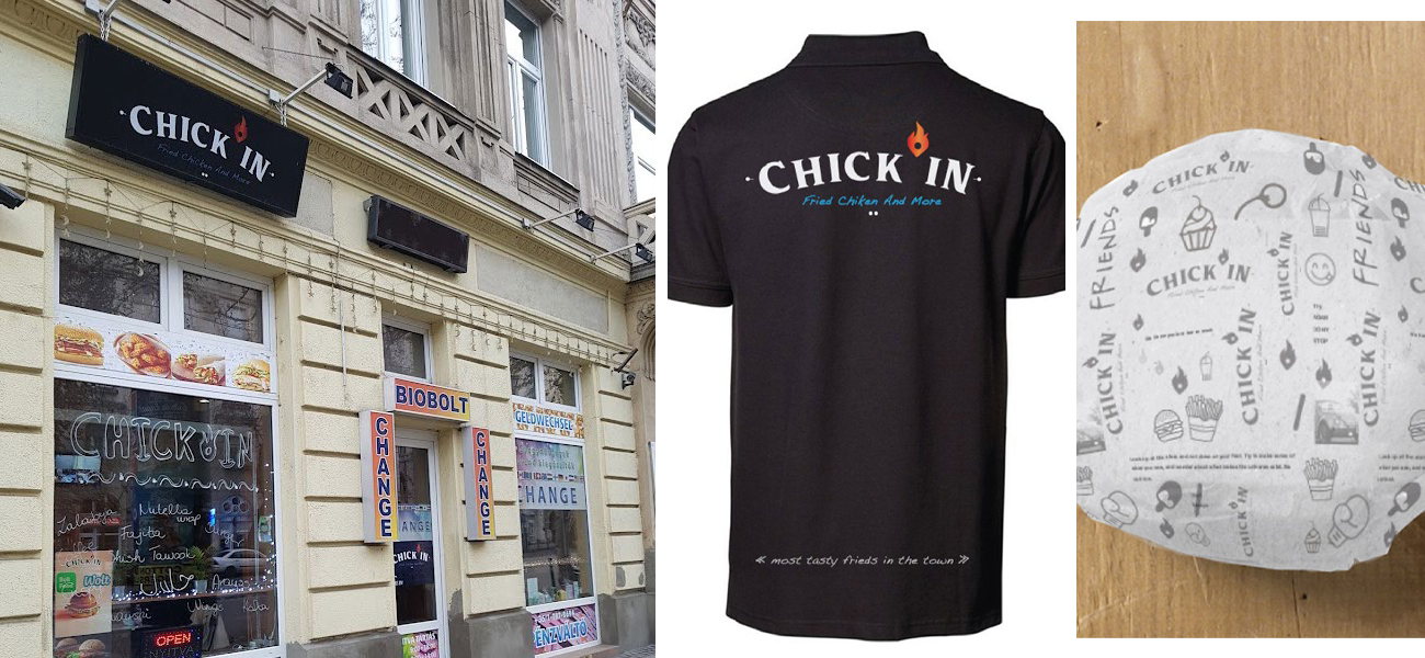
On the street, on the bag, on the back.
The system carries from the storefront on Vaci utca to the take-out bag on a bench, from the staff polo to the delivery sleeve that gets handed to a courier at 11pm. Every surface keeps the same wordmark, the same flame, the same restraint.
If you’re building a brand worth standing for, we’d like to hear about it.
The fastest way to start is a 30-minute conversation about what you’re working on. No deck, no pitch.