
Brixel
150 renovations across Toronto and GTA, guaranteed in writing.
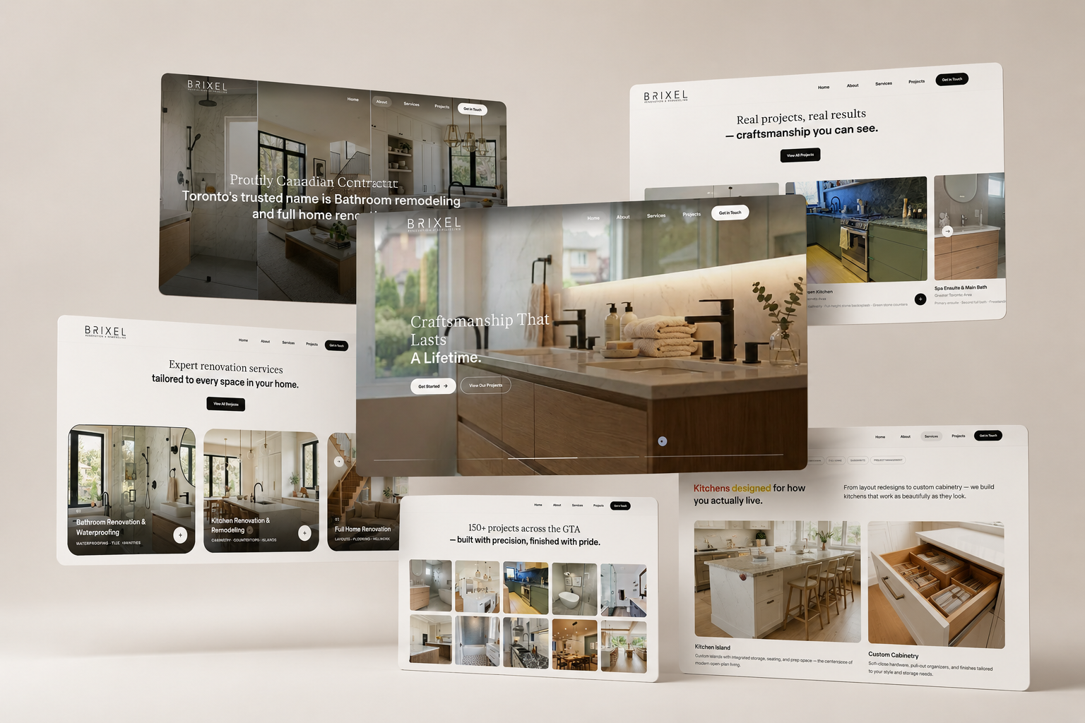
Brixel is a Toronto renovation contractor working across the Greater Toronto Area, with bathrooms and waterproofing as its signature and more than 150 projects behind the name.
We designed and developed the site, and wrote every word of it. Renovation is a trade sold on promises, so we built this one on proof. Black type on warm white, the finished rooms carrying all the colour, five services on one page you can walk rather than a menu you have to navigate. Every project is written in the vocabulary of the trade, the quartz waterfall island, the shiplap feature wall, the white oak floor, because precision on the page is what makes a homeowner believe in precision on site.
- Content Strategy
- Copywriting
- Visual Language
- UX & UI Design
- Web Design
- Development
- SEO & Structured Data
- Content System (CMS)



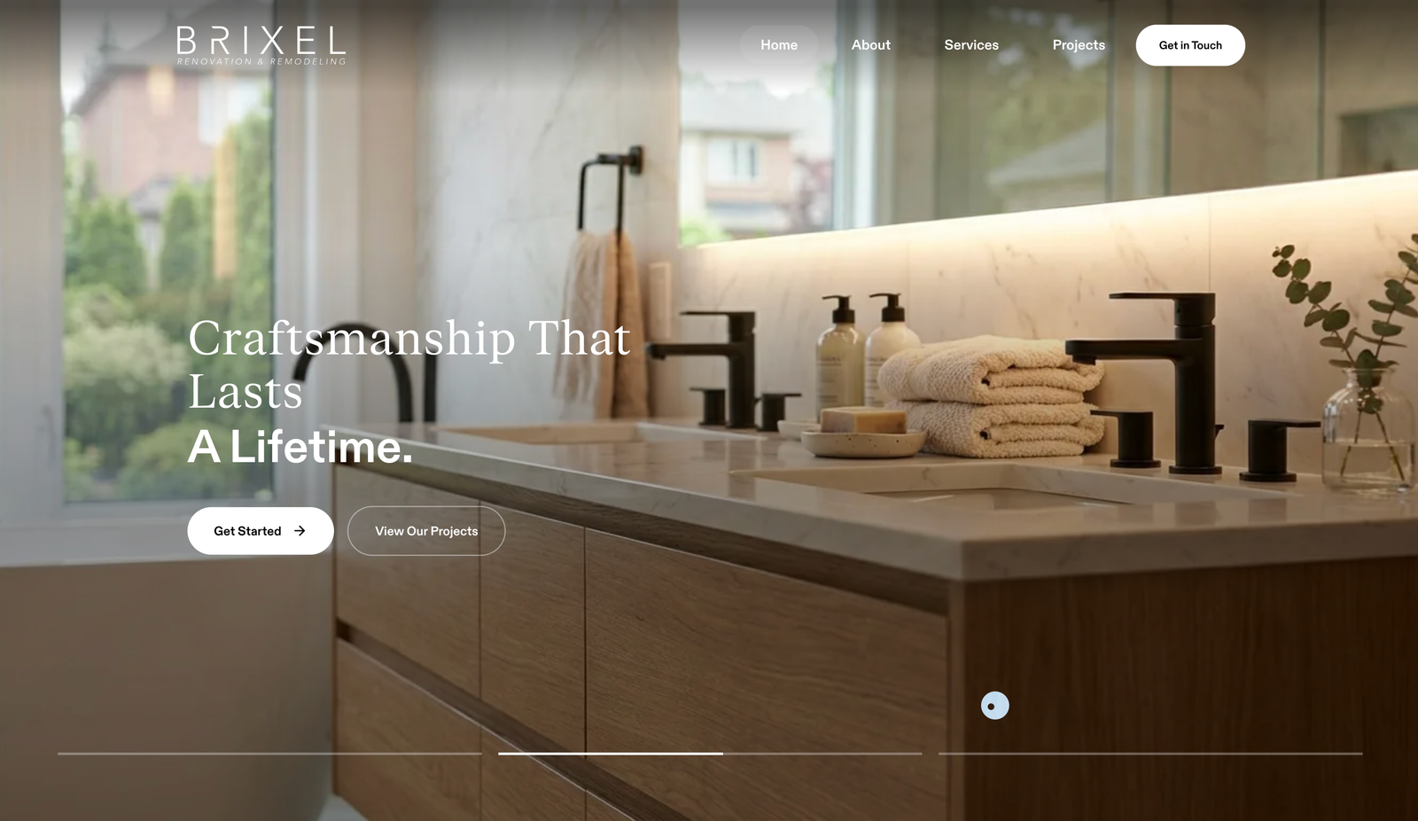
We gave the whole screen to the rooms.
Renovation photography either carries a site like this or nothing does, so we designed around it and moved everything else out of its way. Black type on warm white, no gradients, no decorative rules, nothing coloured competing with a finished bathroom. The interface holds still and the rooms move. Every layout decision after that one followed from it: photography running full width, margins generous enough that a single image can hold a whole screen, and a type scale small enough that a caption never argues with the picture above it.
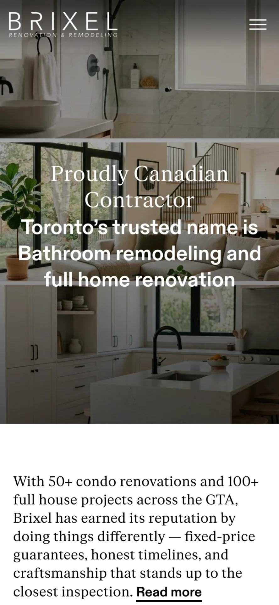
Five pages, and the line that runs through them.
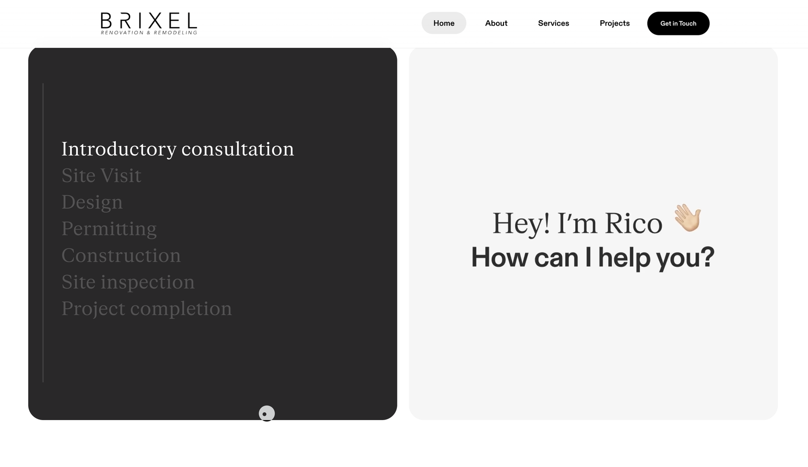
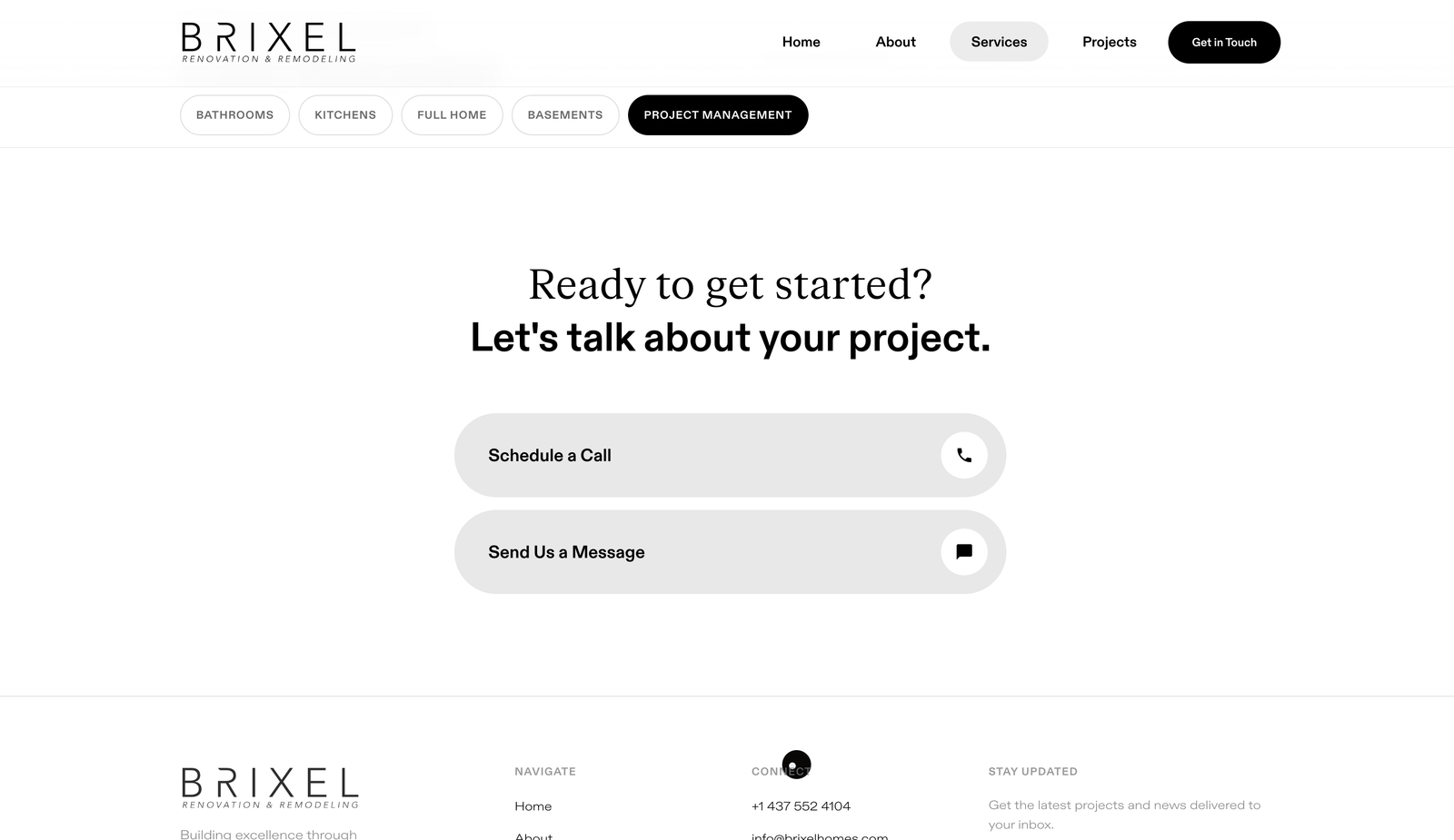
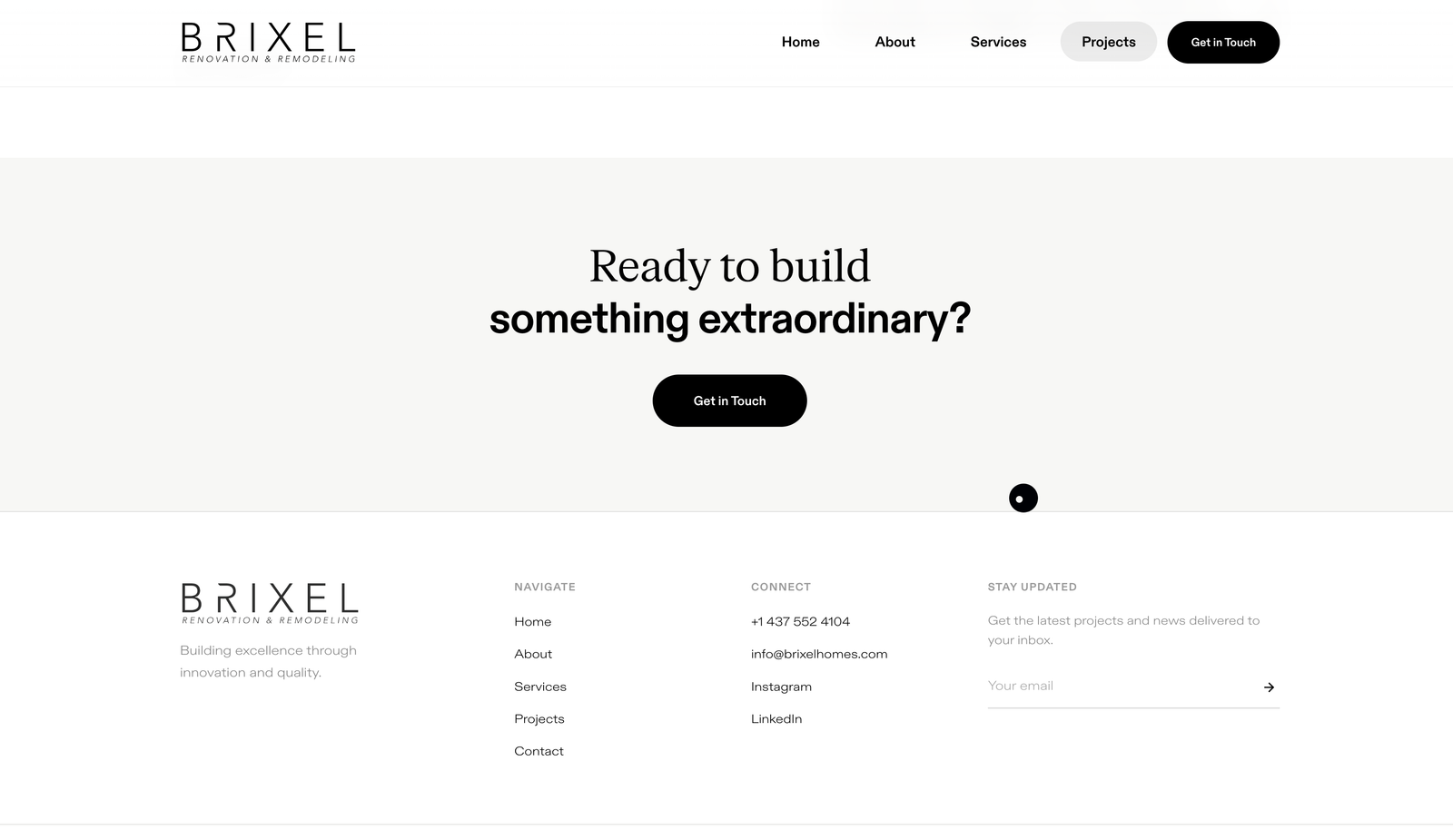
A renovation homeowner does not arrive ready to call. They arrive comparing, so we built the site as one continuous argument rather than five destinations. Home opens on the work and the credentials. Services carries the detail. Projects carries the proof. About answers the question a homeowner is too polite to ask, whether these people will be careful inside the house. Contact qualifies the job before the first phone call, asking what kind of project it is before asking anything else. Every page closes on the same band and the same invitation, and the phone number never leaves the header, so the decision can be made at any depth rather than only at the end of the scroll.
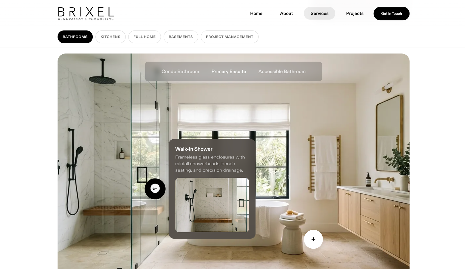
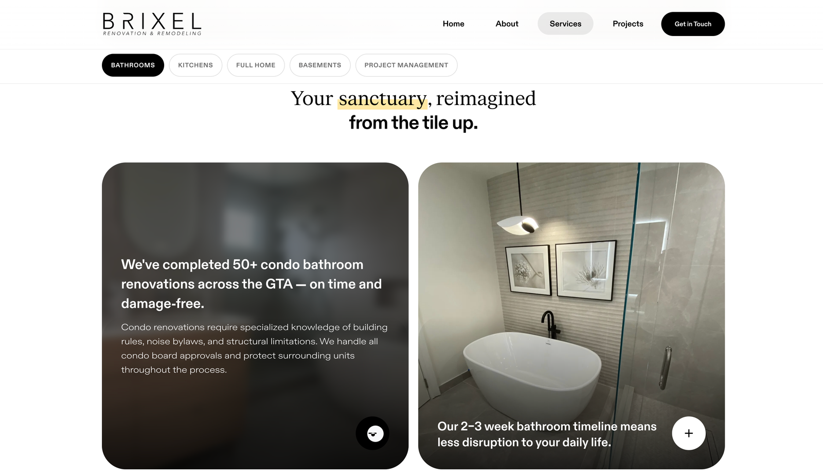
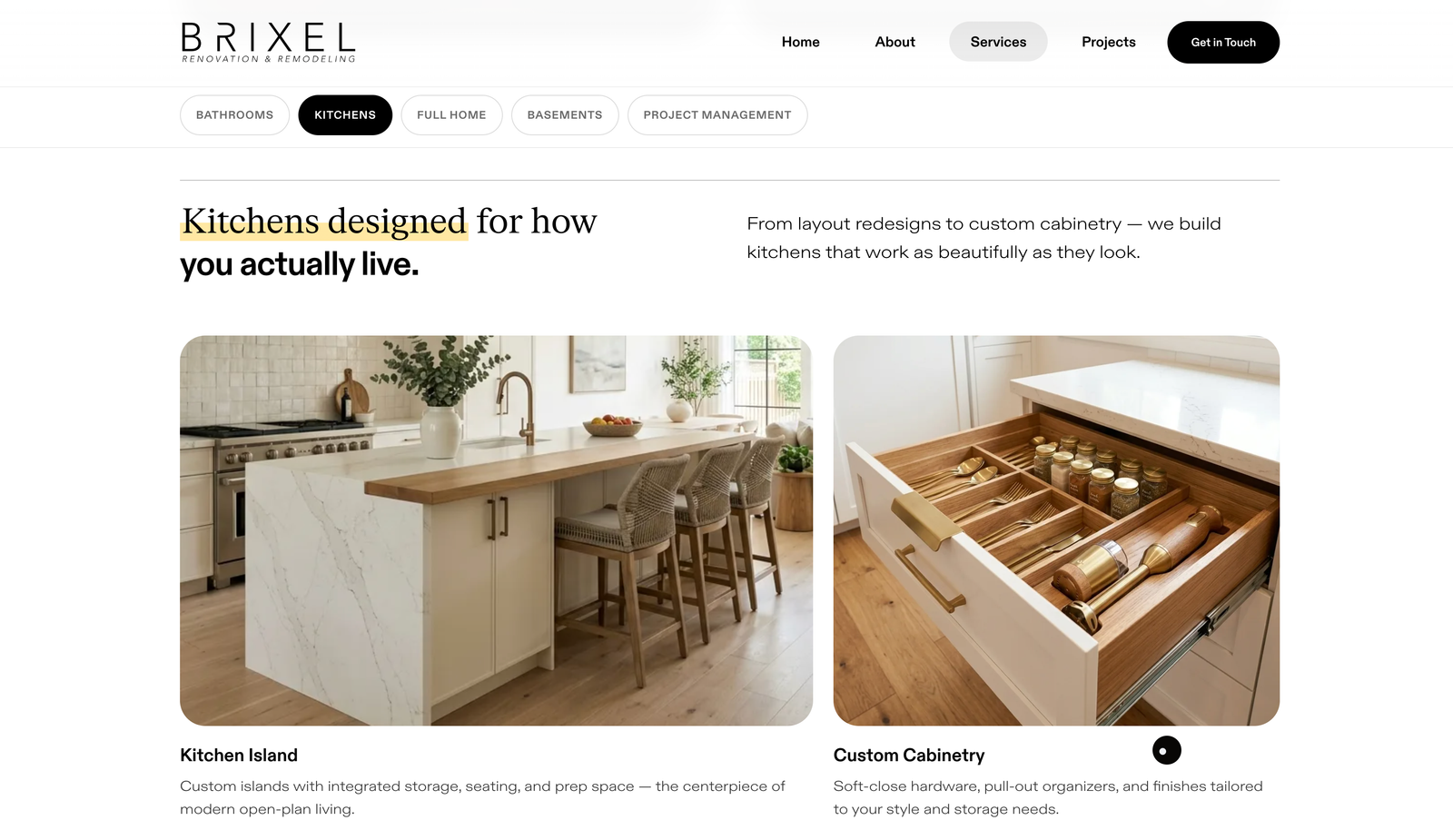
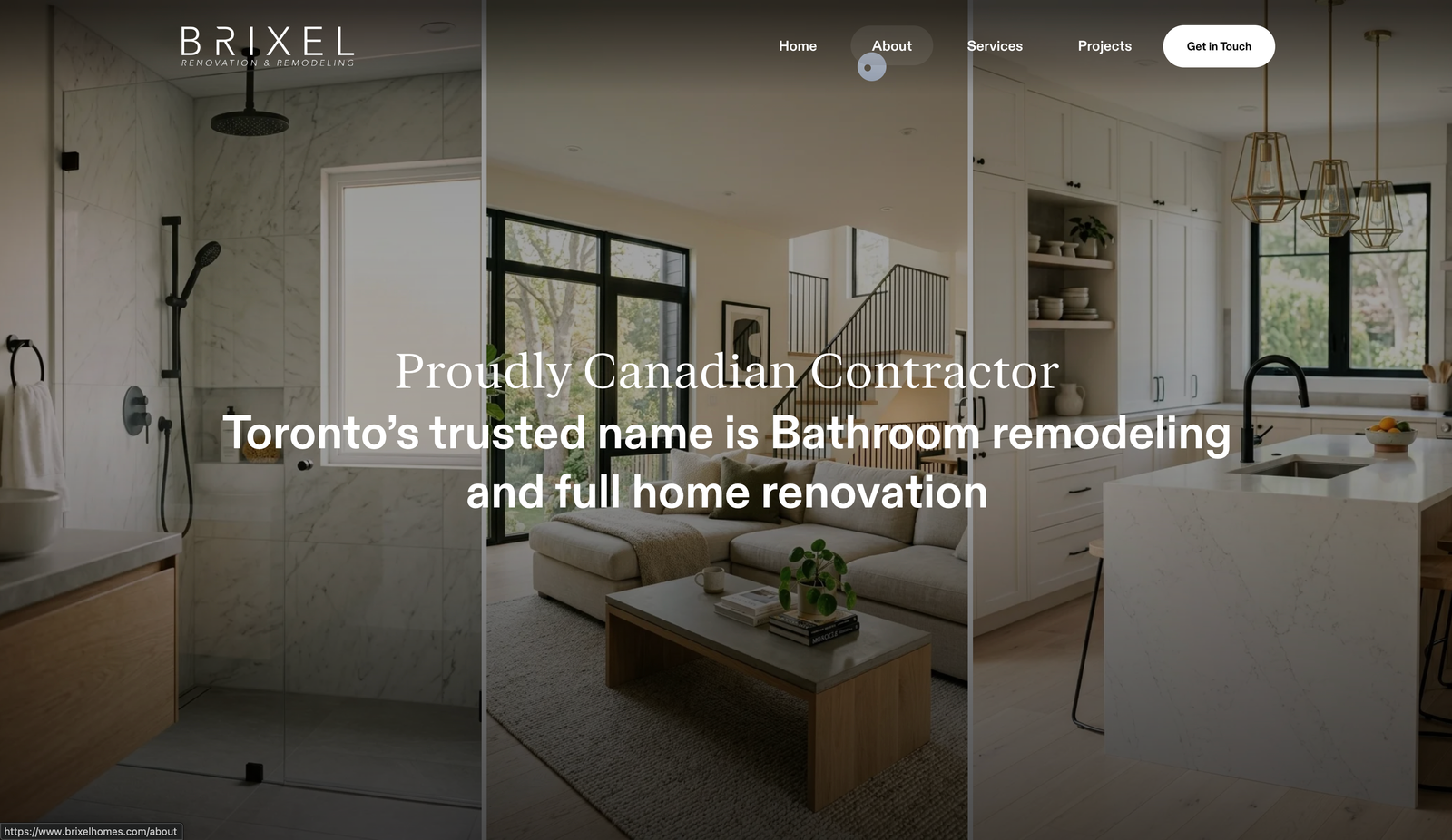
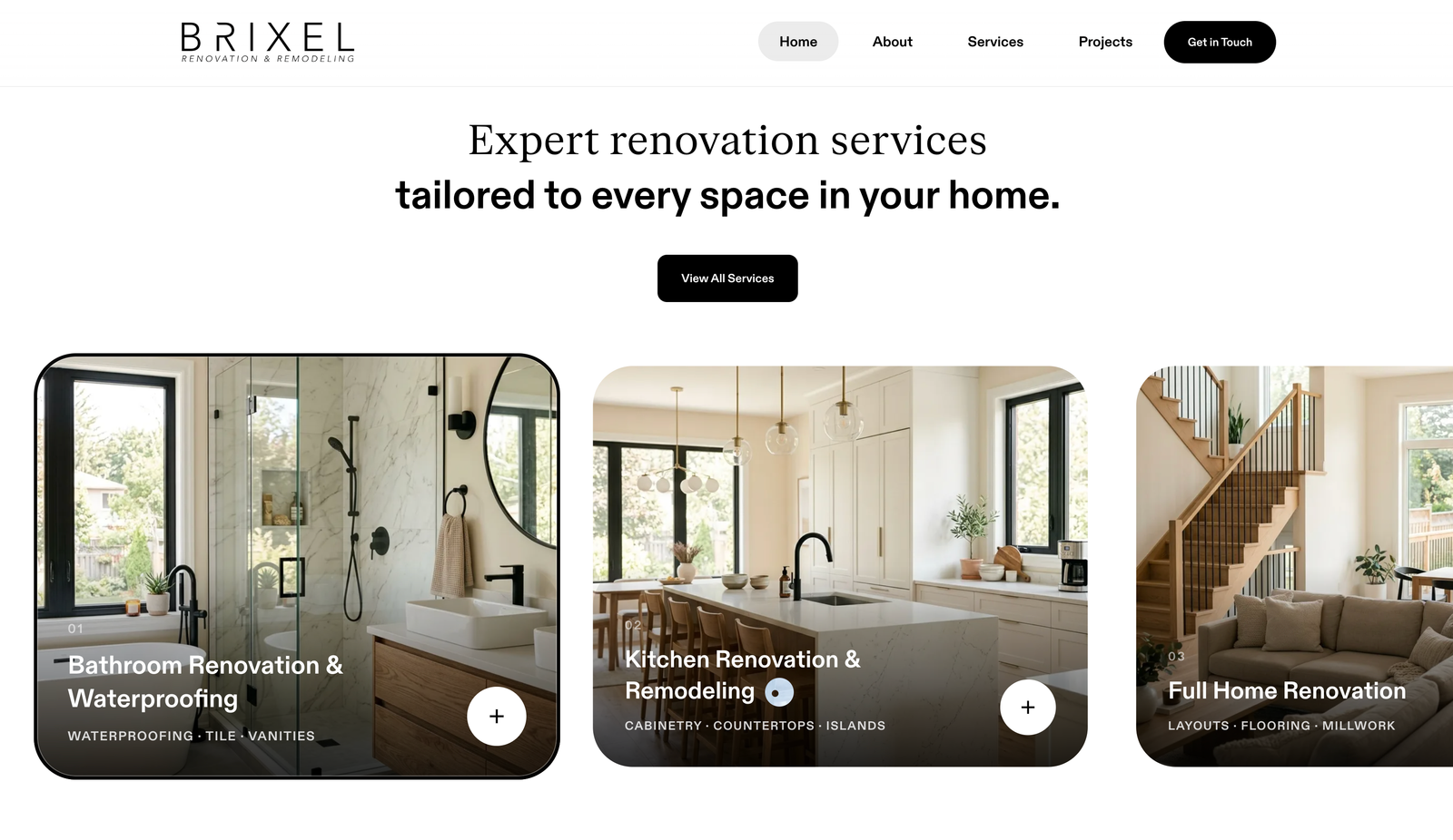
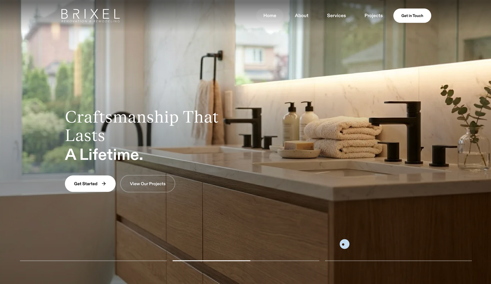
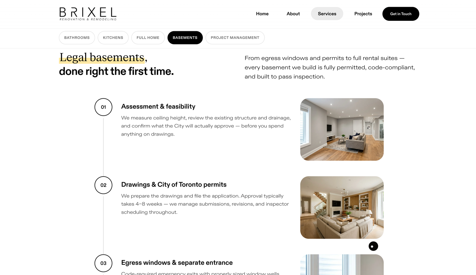
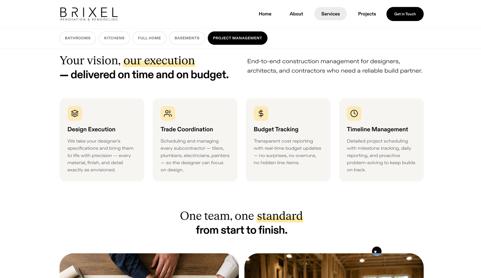
A visual language that stays out of the way.
The brand language had to survive being ignored. On a page where a finished bathroom is doing the persuading, the system's job is to organise and disappear. The palette is black, white and a set of warm neutrals borrowed from plaster and oak, with a single highlighter yellow held back for the one phrase on each page that closes the sale. ABC Diatype carries the structure, extended and light for the reading, bold for the headlines, and FK Roman carries the moments that need warmth.
ABC Diatype for the structure, FK Roman for the moments that need warmth.
One page, five chapters, no dead ends.
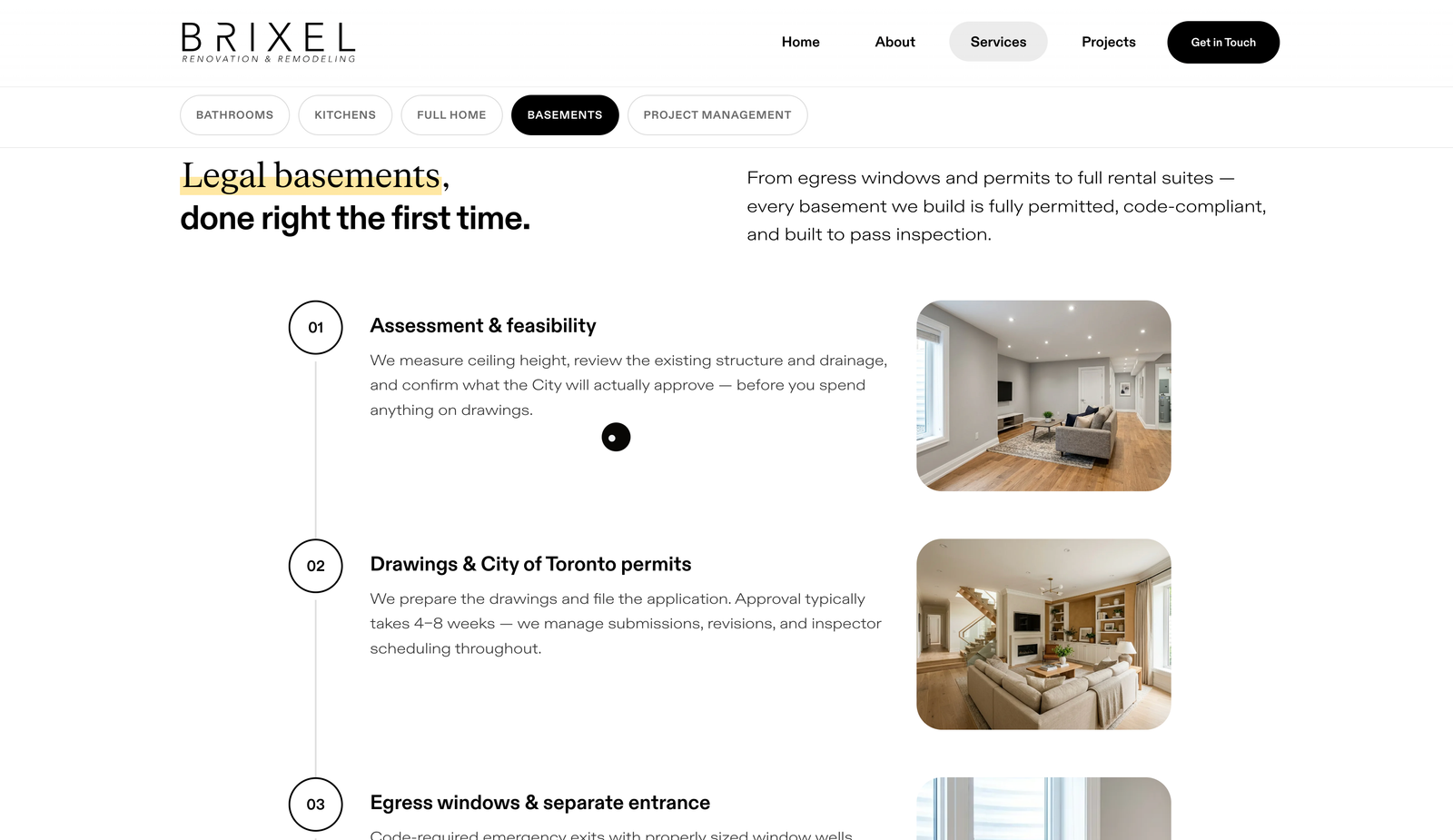
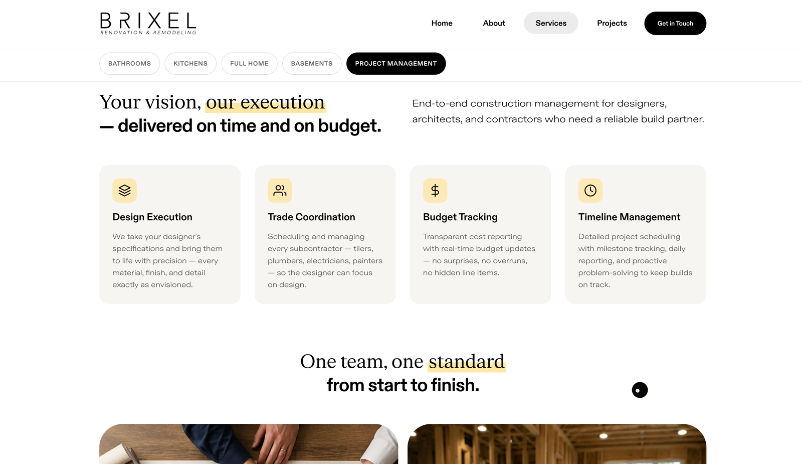
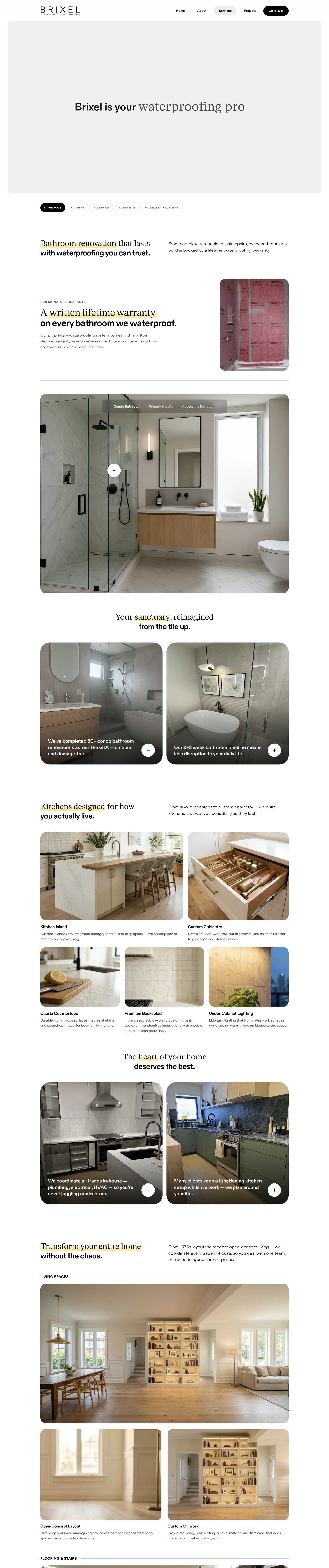
Five services could have been five pages. We put them on one. A homeowner planning a bathroom is usually already thinking about the kitchen, and every extra click is a chance to leave, so bathrooms, kitchens, full homes, basements and project management became anchored chapters on a single scroll, with a jump bar that follows you down it and never loses your place. Inside the bathroom chapter, where the questions get specific, the variants split into tabs: the condo bathroom, the master ensuite, the accessible bathroom. One address absorbs the entire consideration stage.
Selected work, opened in place.
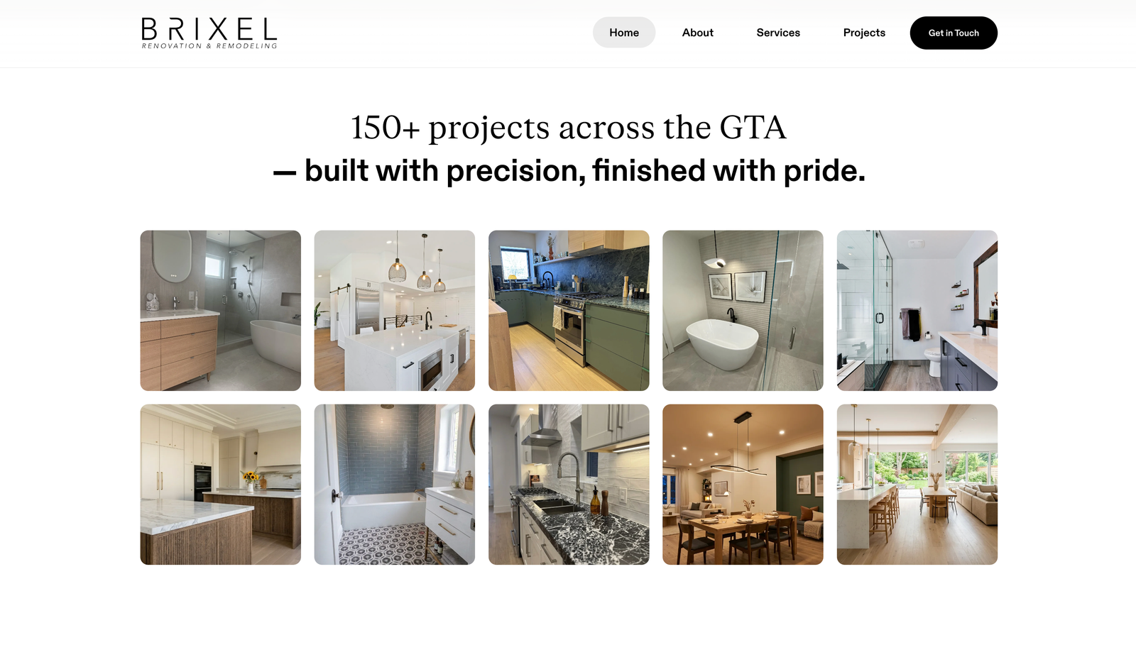
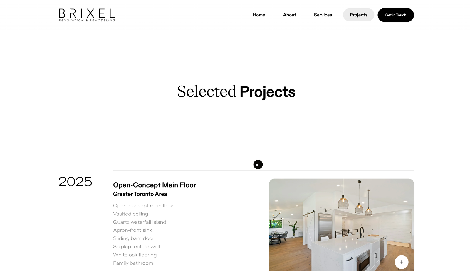
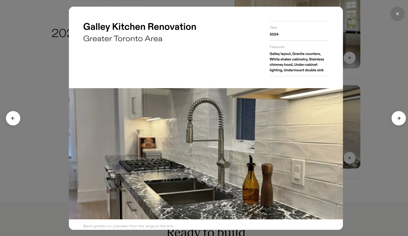
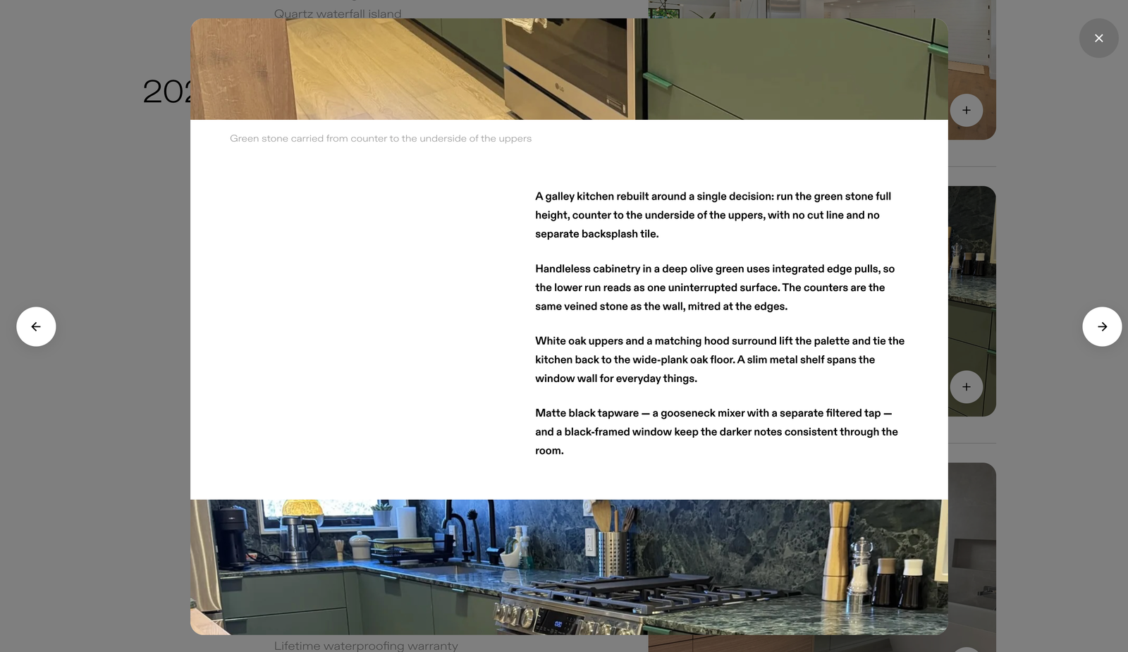
The archive is edited, not exhaustive. A hundred and fifty completed jobs sit behind this company, and showing all of them would have proved less than showing a few properly, so we built it as selected work grouped by year. Each project opens where it sits, with no page load and no way to get lost, carrying its location and the materials it was actually built from: the quartz waterfall island, the apron-front sink, the white oak floor. A homeowner reads a spec list like that and recognises their own project inside it.
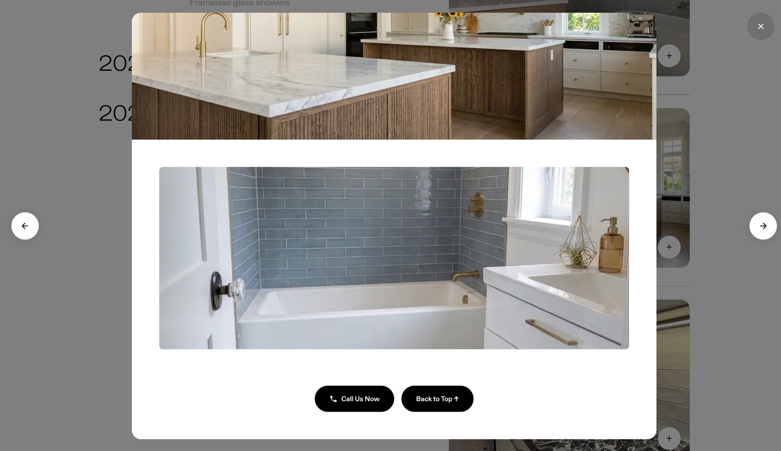
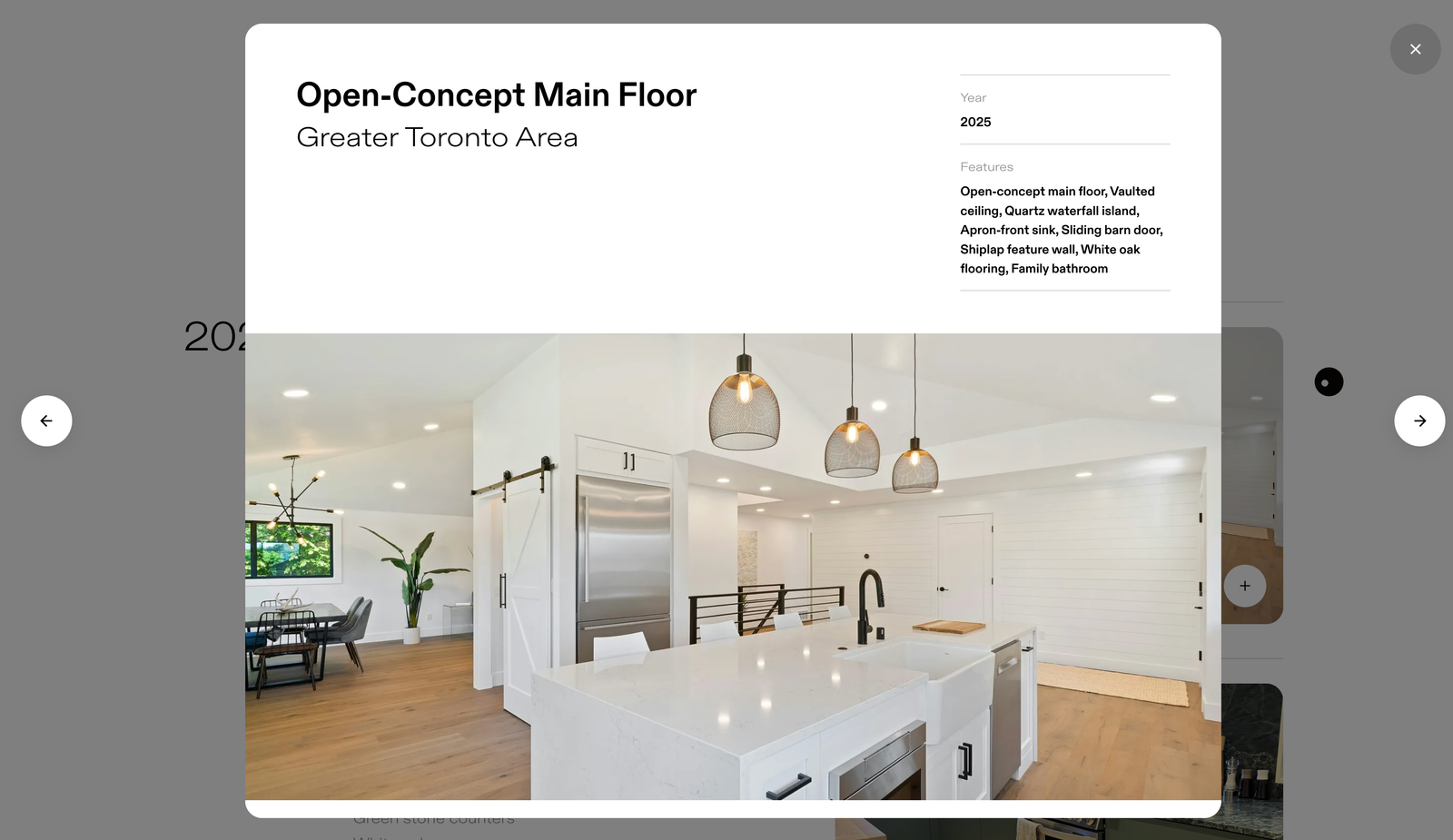
Written in the language of the craft.
Renovation copy is vague on purpose. Quality workmanship. Attention to detail. Satisfaction guaranteed. We went the other way and wrote the whole site in the vocabulary of the trade, naming the quartz waterfall island, the apron-front sink, the shiplap feature wall, the white oak floor, the egress window a legal basement cannot be signed off without. A homeowner reads that and knows the work was done by someone who understands it. It is the one thing on this site a competitor cannot copy without doing the work first.
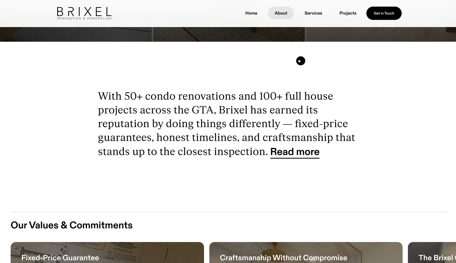
We handed Brixel the keys.
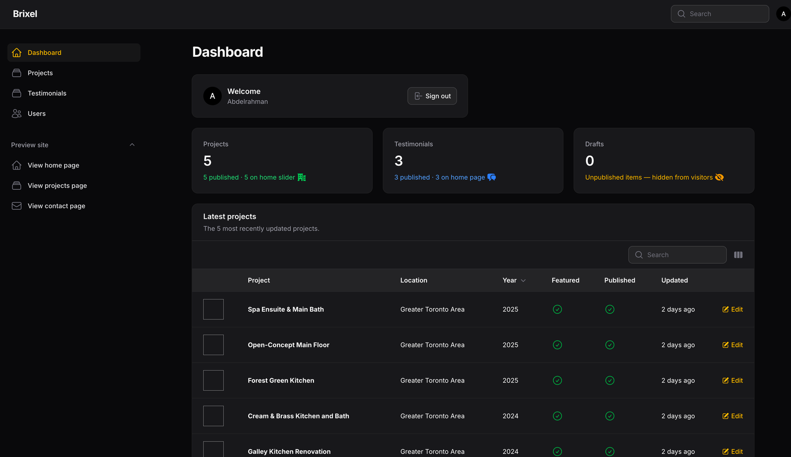
Projects and testimonials are the two things this business adds to, so those are the two things the admin does, and it does them without ceremony. A project carries its hero, its gallery, its location, its materials list and its place in the year. Publish it and it lands on the archive and the home page at once, in the right group, in the right slot. No ticket, no wait, no call to us. We designed it, we built it, and we keep it running.
A trade that runs on trust, given somewhere to point.
Renovation is sold on promises made standing in someone's kitchen, and almost every contractor in the city is asking to be believed. Brixel has somewhere to send people instead. The work is visible, the process is legible, the writing is specific enough to prove itself, and the whole thing is theirs to keep adding to, one room at a time.
If you’re building a brand worth standing for, we’d like to hear about it.
The fastest way to start is a 30-minute conversation about what you’re working on. No deck, no pitch.