AGORA
A retail brand built from the public square.
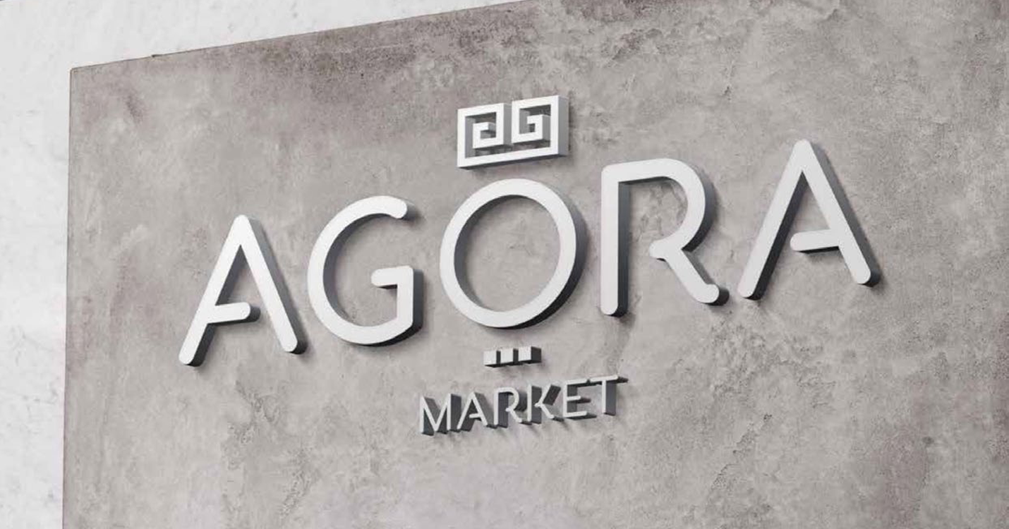
We led brand strategy, identity, and the full launch campaign for Agora Market. The mark borrows the Greek meander, the pattern that runs along every classical agora, and packs it into a single tile that becomes the brand stamp. The wordmark sits in royal blue, the system carries from the storefront signage to the bakery sub-brand to the private-label packaging, and the campaign runs on simple, clear sale grids.
- Brand Strategy
- Brand Identity
- Sub-brand System
- Packaging Design
- Advertising Campaign
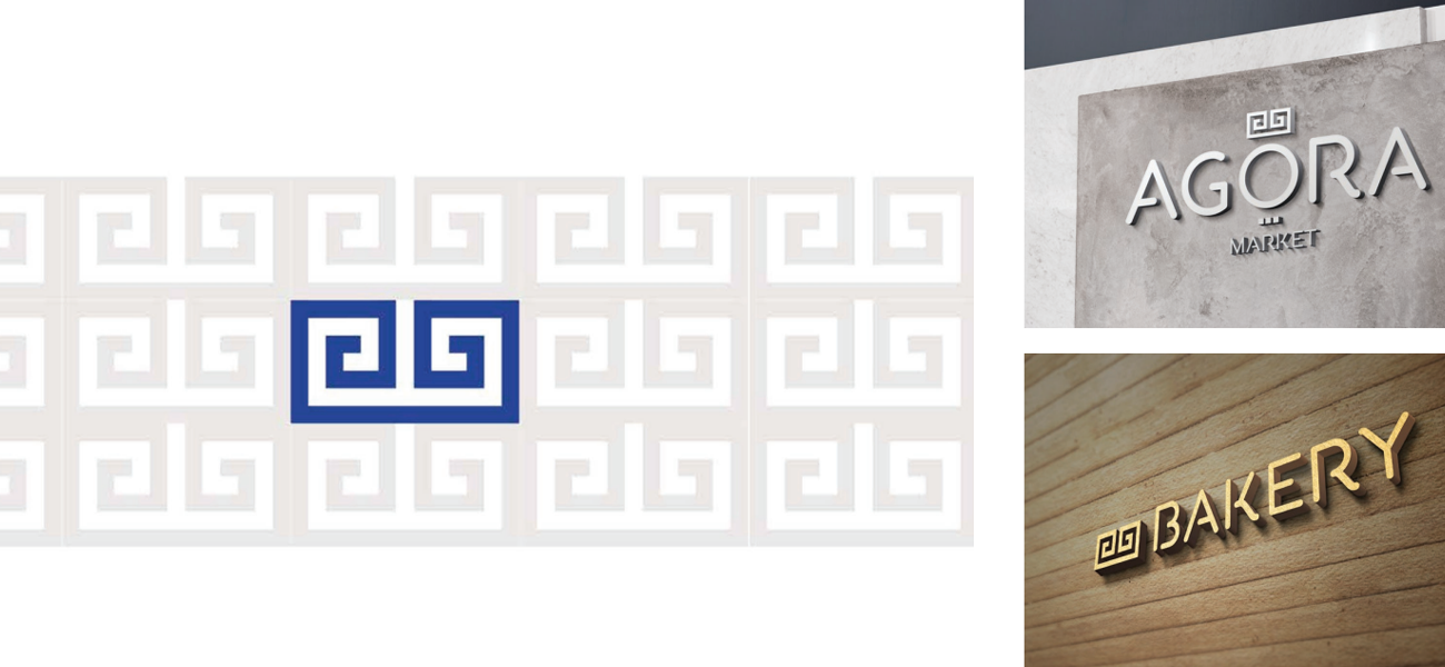
The brand is a pattern.
We anchored Agora in the Greek meander, the unbroken line that runs along every classical agora floor. The mark stamps a single tile of it in royal blue, then lets the pattern repeat behind every sub-brand. Same logic on the bakery sign, same logic on the supermarket facade.
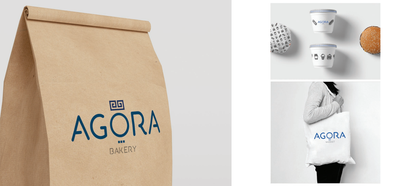
The market, packaged.
The system carried into private label, from a bakery kraft bag to ceramic mugs to a cotton tote. Each piece earns its place on the shelf without shouting, the meander holding the whole range together.
And the summer sales.
The campaign layer kept things plain. A bright yellow ground, a hand-lettered SALE on a cloud, the product in the middle. Made for thumbs, made for windows, made for both at once.

If you’re building a brand worth standing for, we’d like to hear about it.
The fastest way to start is a 30-minute conversation about what you’re working on. No deck, no pitch.